
Three years ago, I decided to paint my downstairs powder room completely black. I bought two gallons of premium flat dark paint, rolled it on the walls and the ceiling, swapped out the light fixture, and stepped back to admire my work.
It looked incredible on Instagram. But in real life? It was a disaster.

The flat paint absorbed every single lumen of light in the room. Guests were using the flashlight on their iPhones just to find the soap dispenser. Worse, every time someone dried their hands and splashed a single drop of water on the wall, the flat black finish grabbed the mineral deposit and left a permanent, chalky white stain. I had to repaint the entire room six months later.
When you search for moody half bathroom ideas online, you are blasted with hundreds of heavily edited, professionally lit photos that completely ignore how these spaces actually function in reality. A powder room is a utilitarian space. It deals with water, humidity, soap, and high foot traffic. If you want that dramatic, high-end hotel aesthetic, you can’t just slap a coat of dark paint on drywall and call it a day.
You have to engineer the space. You have to balance light reflectance, manipulate texture, and choose materials that fight against the claustrophobia inherent in a tiny, dark room. Here is the unfiltered, field-tested guide to executing a moody half bathroom that actually works in real life.
The Psychology of Small, Dark Spaces
The biggest objection people have to going dark in a small bathroom is the fear that it will make the room feel smaller. This is a myth based on a misunderstanding of spatial psychology.
When you paint a small 5×5 box a bright, sterile white, you aren’t making it look bigger; you are just highlighting the exact boundaries of how small the box is. Every corner, every shadow, and every imperfection in the drywall is thrown into sharp relief.
A dark, moody palette does the opposite. Deep greens, charcoals, aubergines, and blacks blur the edges of the room. When you paint the walls, trim, and ceiling the same dark color (a technique called color drenching), the corners of the room visually recede. Your eye cannot easily register where the wall ends and the ceiling begins. It creates an infinite, enveloping feeling—like stepping into a velvet jewelry box.
But this illusion shatters the second you use the wrong materials.
Paint, Plaster, and Wallpaper: Getting the Walls Right
The walls are doing 90% of the heavy lifting in a moody bathroom. Your choice of finish will dictate whether the room feels like a luxury speakeasy or a neglected basement closet.
The Finish Trap (Why Matte is a Mistake)
In my early testing, I assumed matte paint was the secret to a moody look. Matte absorbs light, hiding drywall imperfections. But in a bathroom, matte paint is your worst enemy. Dark pigments in matte or flat finishes burnish immediately. If you rub your shoulder against the wall, it leaves a shiny streak. If toothpaste splatters, trying to wipe it off will literally remove the pigment from the wall.
For a moody half bath, you must use an eggshell or satin finish for the walls, and a semi-gloss for the trim. The slight sheen does two things: it protects the wall from moisture, and it bounces whatever ambient light you have around the room. If you want to level up, take a page from high-end European design and use a high-gloss lacquer on the ceiling. A glossy dark ceiling acts like a mirror, reflecting the light from your fixtures and making the ceiling feel twice as high.
Limewash and Roman Clay
If you want to completely eliminate the risk of a flat, dead-looking wall, skip traditional latex paint entirely and use Limewash or Roman Clay.
I recently tested Portola Paints’ Roman Clay in a deep olive green (“Truffle”) for a powder room build. Applied with a putty knife, it creates a subtle, suede-like texture with natural highs and lows. Because the material itself has a mottled finish, it inherently plays with light and shadow. It gives the room architectural depth that a roller and standard paint simply cannot replicate.
High-Drama Wallpaper
If paint feels too flat, a moody, large-scale wallpaper is the easiest cheat code in interior design. The trick here is scale. People often choose tiny, delicate floral prints for small bathrooms, thinking it matches the scale of the room. This makes the space feel busy and chaotic.
Instead, force an oversized, dramatic print into the small space. A massive, dark botanical print or an Art Deco geometric pattern in charcoal and brass commands attention. Just make sure the wallpaper is vinyl-coated or sealed to handle the inevitable water splashes near the sink.
Lighting a Moody Bathroom: The Make-or-Break Factor
If you paint a room Hague Blue and throw a single 4000K LED bulb on the ceiling, you haven’t created a moody retreat; you’ve built an interrogation cell. Lighting is the single reason most moody bathrooms fail in residential homes.
Layering Lumens (Kill the Overhead Light)
In a moody space, overhead lighting casts harsh, unflattering shadows down the face, aging whoever is looking in the mirror by ten years. I highly recommend disabling your overhead fan/light combo if it’s the only light source, or putting it on a separate, strictly-for-cleaning switch.
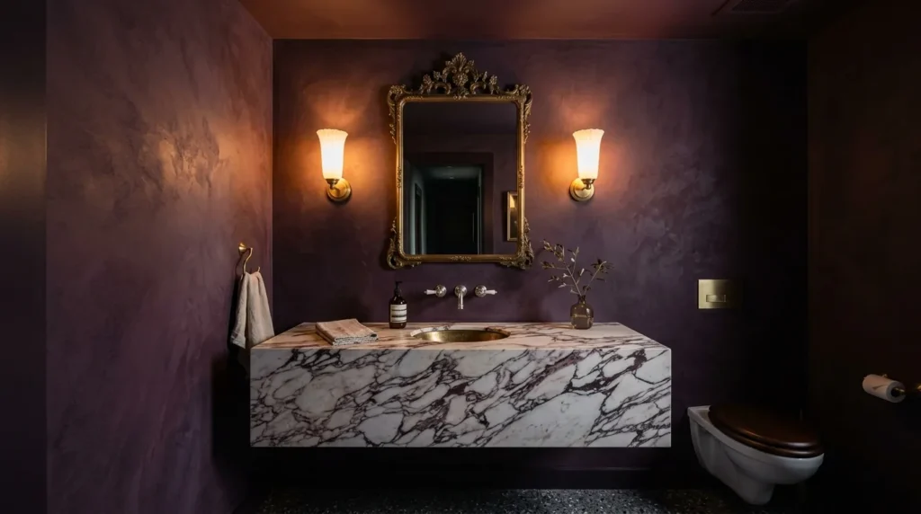
Your primary lighting should come from wall sconces mounted at eye level (roughly 60 to 65 inches off the floor), flanking the mirror. This provides cross-illumination that washes the face evenly.
Color Temperature and Shades
When testing bulbs against dark paint, color temperature is everything. Dark blue and green walls will completely swallow cool light (3500K and above). You want bulbs in the 2700K range. This warm, amber-toned light reacts beautifully with dark pigments, making the room feel cozy rather than cold.
Furthermore, pay attention to the sconce shades. Clear glass or exposed Edison bulbs create a harsh glare that is magnified against dark walls. Use milk glass, frosted glass, or linen shades to diffuse the light. The goal is a soft, ambient glow that pools around the sink, not a spotlight.
Materials and Metals: Contrast is Your Best Friend
A moody bathroom is a masterclass in tension. If everything in the room is dark and matte, the space feels heavy. You have to introduce elements that fight back against the darkness.
Unlacquered Brass and Polished Nickel
Avoid matte black hardware in a moody bathroom. It disappears into the walls and offers zero visual relief. This is the perfect environment for living finishes like unlacquered brass.
Against a dark navy or charcoal wall, brass acts like jewelry. It catches the ambient light from your sconces and reflects it back into the room. Over time, as the brass patinas from the oils in your hands and the moisture in the air, it develops a deep, organic character that perfectly complements a moody aesthetic. If brass isn’t your style, polished nickel—which has a warmer, slightly golden undertone compared to the harsh blue of chrome—is a fantastic alternative.
Stone and Veining
The vanity countertop and the sink are your best opportunities to introduce bright, high-contrast organic movement. A stark white porcelain pedestal sink works, but a floating marble vanity with heavy, dramatic veining (like Arabescato or Calacatta Viola) grounds the space.
When testing vanity tops, I found that heavily veined natural stone acts as a visual anchor. The eye is immediately drawn to the brightness of the marble, which distracts from the tightness of the room. It’s a purposeful flash of luxury in an otherwise dark envelope.
Critical Mistakes to Avoid (The “Dungeon” Traps)
After tearing down and rebuilding several of these spaces, here are the exact mistakes that will ruin your moody half bath:
Leaving a White Ceiling: The most common mistake. Painting the walls dark but leaving the ceiling “builder white” creates a harsh, horizontal line that visually chops the room in half and makes the ceiling feel drastically lower. Paint the ceiling the same color as the walls, or go one shade darker.
The Half-Wall Compromise: People get scared of committing to dark walls, so they install white wainscoting on the bottom half and paint the top half dark. While this is a classic look, it is not “moody.” It’s traditional. If you want the enveloping, dramatic effect, the dark color must stretch from the baseboards to the crown molding.
Ignoring the Floor: A dark room with a cheap, light-colored linoleum floor looks like an unfinished construction project. If you can’t replace the flooring, anchor it with a dark, vintage-style Turkish rug that ties in the wall colors. If you are replacing the floor, matte black hex tiles, slate, or a heavily patterned encaustic cement tile will hold up to the visual weight of the walls.
The Final Takeaway
Designing a moody half bathroom requires a leap of faith. It goes against every standard rule of real estate staging that tells you to paint everything “agreeable gray” to make it look bigger. But the powder room is the one space in your house where you spend a maximum of five minutes at a time. It doesn’t need to be airy and bright. It is a transitional space, a brief departure from the rest of your home.
Commit to the bit. Choose a dark, complex color with an eggshell finish. Layer your ambient lighting at eye level. Throw in a massive slab of contrasting marble or a wildly oversized brass mirror. When you stop treating the half bath as an afterthought and start treating it as a jewel box, the lack of square footage stops being a liability and becomes the very thing that makes the room work.