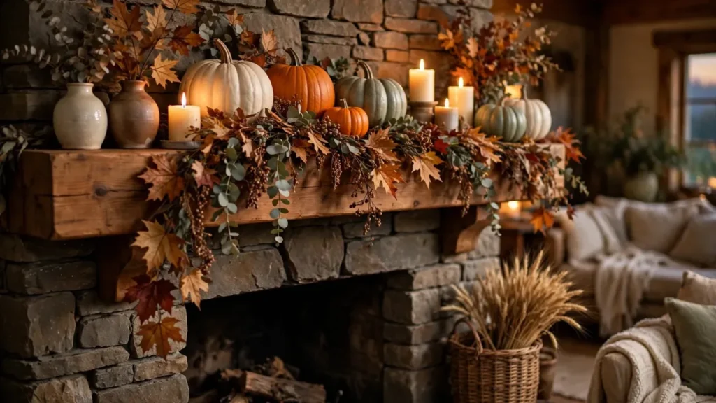

Last October I stood in my living room at 11pm, surrounded by fourteen pumpkins, three garlands I didn’t need, and a mantel that somehow looked worse than when I started. My husband walked in, looked at the mess, and said, “It looks like a pumpkin stand exploded.” He wasn’t wrong.
That disaster was actually the best thing that happened to my fall decorating, because it forced me to learn something I wish someone had just told me: a good fall mantel isn’t about how much stuff you pile on it. It’s about a few smart choices. This year my mantel took twenty minutes, I spent almost nothing new, and it’s the first thing guests comment on. Here are the ideas that actually worked — including the mistakes I’d tell you to skip.
The 3 Rules That Fixed My Mantel
Before the ideas, the three things that changed everything for me:
1. Heights beat quantity
A mantel covered in same-size pumpkins reads as clutter. A mantel with three clear heights — tall (branches, candlesticks, a framed piece), medium (pumpkins, vases), low (small gourds, candles) — reads as styled. When in doubt, add a riser instead of another object. A stack of old books or a small wooden box under a pumpkin does more than a fifth pumpkin ever will.
2. Group in odd numbers
This sounds like a Pinterest platitude, but it genuinely works. Three candlesticks look intentional. Four look like you’re setting a dinner table. Clusters of three or five create little “moments” the eye can rest on instead of one long, flat line of stuff.
3. Leave empty space on purpose
The single biggest mistake — mine included — is filling every inch. Negative space is what makes the pretty things actually visible. If your garland is hiding the mirror behind it, trim the garland, not your expectations.
15 Fall Mantle Decor Ideas to Try This Year
1. The Off-Center Harvest Basket
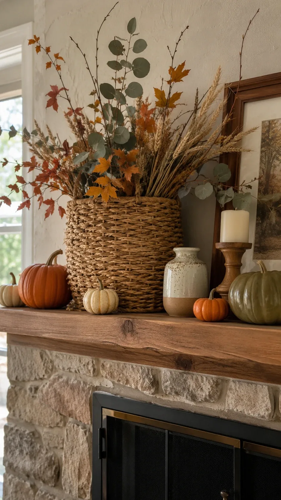
This is my favorite trick in the whole list. Take a big woven basket — laundry size, nothing precious — and put it off to one side of the mantel instead of dead center. Stuff it loosely with dried wheat stems, eucalyptus, and a few tall branches. Then dot mini pumpkins along the base to tie it to the mantel surface.
The off-center placement is the whole secret. Centered, it looks like a product display. Off-center, it looks like you have taste. Balance the other side with one small vase and you’re done.
2. Pumpkins + Candlelight (the 10-Minute Mantel)
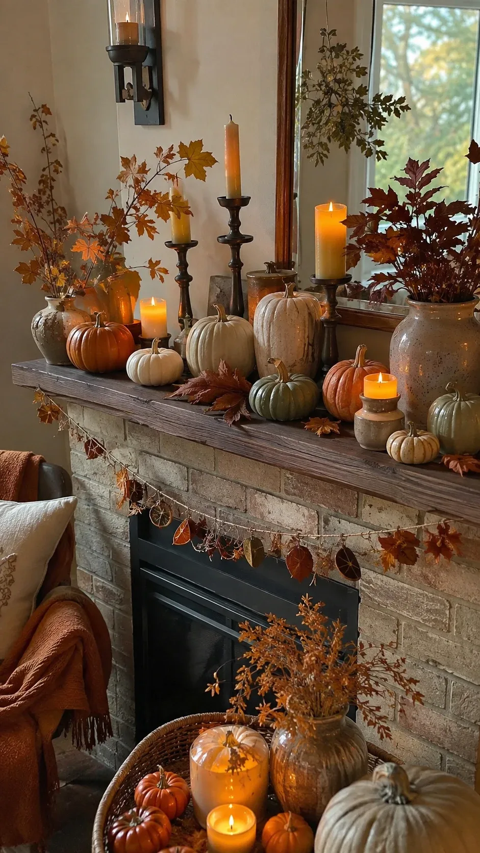
When I’m lazy — which is often — this is the whole plan: pumpkins in cream, muted orange, and deep brown, plus candles at different heights. The candles are what make it look expensive. I use a mix of real pillar candles on sturdy holders and flameless ones tucked close to dried foliage (real flames next to dried leaves is a house fire waiting to happen — I learned the flameless lesson the year my garland started smoking).
Fewer pumpkins than you think, by the way. Five good ones with breathing room beat twelve crowded ones every time.
3. The Vintage Collection Look
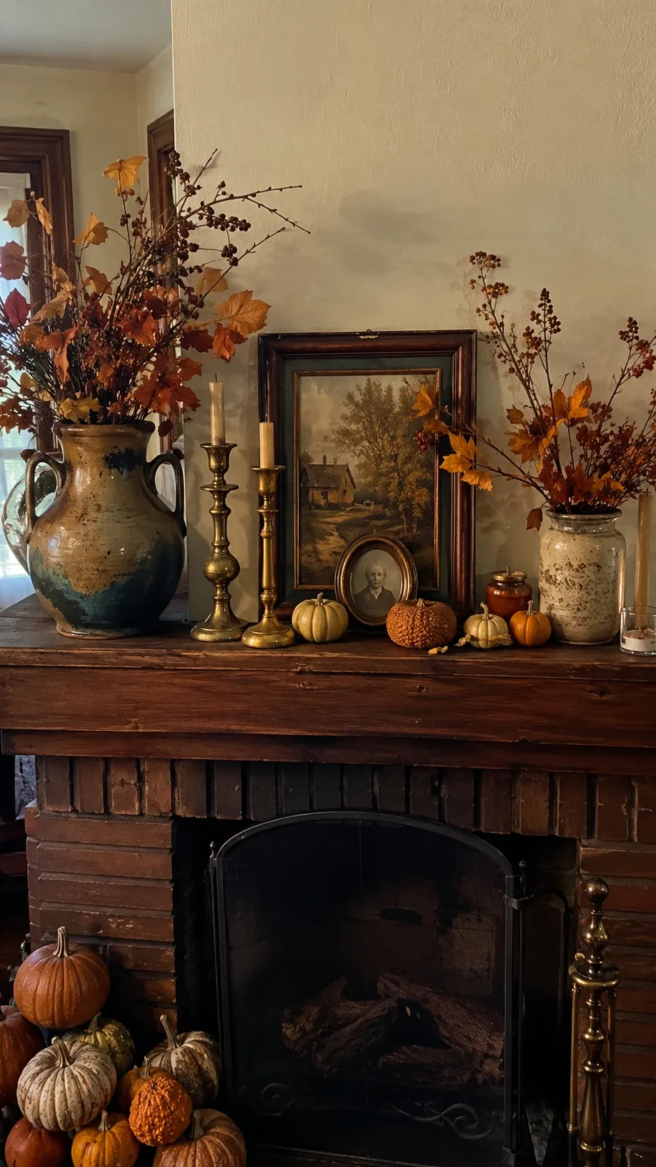
This one is for people who hate obvious seasonal decor. Gather pieces that look collected over decades: an aged frame, brass candlesticks from a thrift store, a crock-style vase, ceramic pumpkins. Mix the finishes on purpose — if everything matches, it reads as a boxed set.
Lean a piece of vintage-looking autumn artwork in the center, build outward with the candlesticks, and tuck three small pumpkins in where it feels sparse. It looks like a mantel that’s been evolving for years, not decorated last weekend.
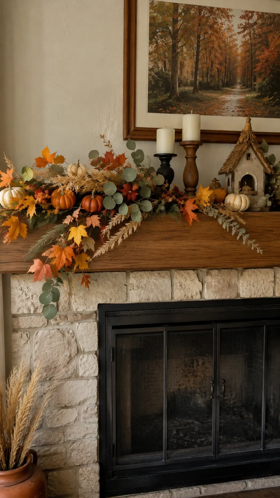
4. The Lopsided Garland
Garlands don’t have to run evenly across the mantel — in fact, they look better when they don’t. Drape yours so it gathers thick on one side and trails thin toward the other end. Layer a faux leaf garland with some dried branches or berry stems for texture.
Use a little floral wire to pin it in place; otherwise it migrates every time you dust. And if you have a mirror or art above the mantel, keep the center slightly open so it doesn’t fight the garland.
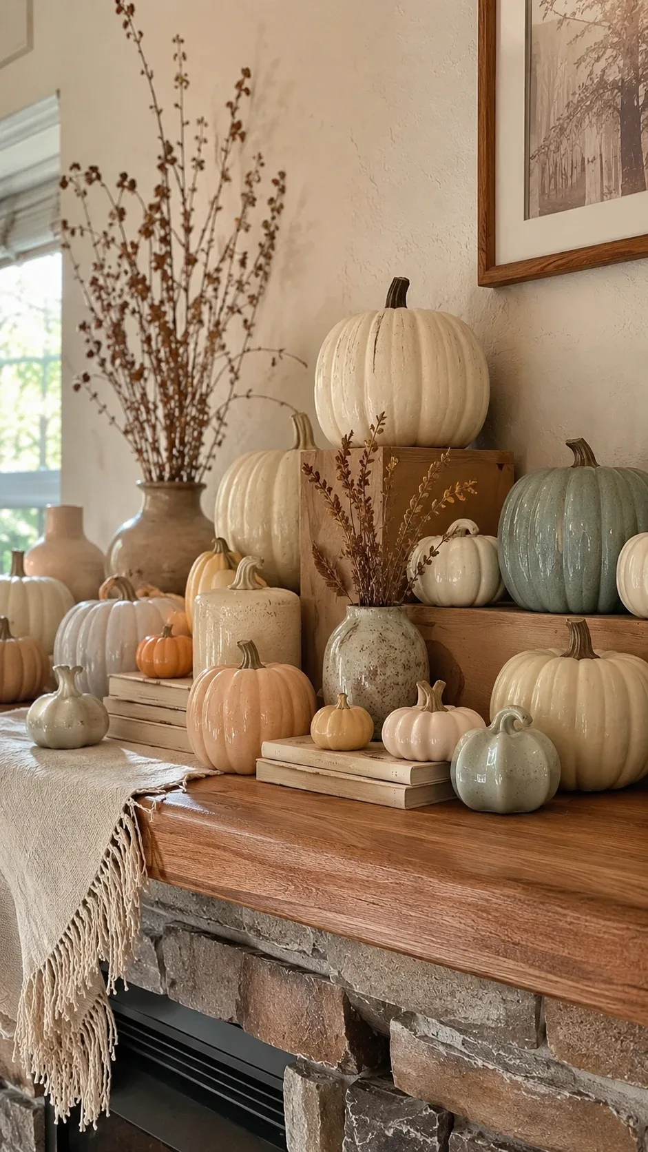
5. Neutral Pumpkins on Risers
If bright orange isn’t your thing, go all neutral: cream, ivory, sage, and blush pumpkins. The trick that makes this look styled instead of random is height — group them in clusters on small risers, book stacks, or low wooden pedestals.
Mix real and ceramic pumpkins for texture. I bought my ceramic ones at an after-Halloween sale for 70% off, and honestly they look better than the real ones. Repeat the neutral tone somewhere else in the room — a throw pillow, a vase — and the whole space feels pulled together.
6. One Plaid Accent, That’s It
Plaid is the fastest way to say “autumn,” but a little goes a long way. Pick ONE plaid moment — a ribbon woven through the garland, a small fabric banner, or a plaid runner under the pumpkins. Then echo its colors subtly with the pumpkins and foliage around it.
Two different plaids competing on one mantel is how you get visual chaos. Choose the dominant pattern, commit, and keep everything else simple so the plaid reads as an accent instead of the entire theme.
7. Dried Wheat and Corn in Pitchers
Nothing says harvest like dried wheat bundles. Put them in tall ceramic pitchers or heavy vases — top-heavy arrangements tip, and wheat sheds everywhere if it leans. Two pitchers of different heights, a few small gourds between them, done.
This look works beautifully with rustic rooms, and it’s cheap: a bundle of dried wheat from a craft store costs less than lunch and lasts the whole season. Make one bundle slightly taller than the other; perfectly matched pairs look stiff.
8. Books as Risers (the Free Trick)
Before buying risers, raid your bookshelf. Stacks of hardcover books in warm neutral tones make perfect platforms for a candle, a small pumpkin, or a ceramic vase. Turn some spine-out and some sideways so it doesn’t look like a library shelf.
This is how my cottage-style mantel finally clicked — the books made it feel lived-in instead of decorated, and the uneven stacks added the height variation the display was missing.
9. Black and Cream for a Modern Edge
If traditional orange-and-red fall decor isn’t your style, try black and cream: black candlesticks, cream pumpkins, pale pottery, a few dark branches. It reads sophisticated, not Halloween-y, as long as you repeat each color a few times so it feels intentional.
Soften the contrast with natural wood or a woven piece — otherwise the high contrast can feel a little severe. This is my pick for modern living rooms that want seasonal warmth without going full harvest.
10. Dress the Hearth, Not Just the Mantel
A mantel looks twice as good when the hearth gets in on it. Echo two or three of your mantel materials below at a larger scale: a floor basket of firewood, a few pumpkins, a lantern. Don’t duplicate the arrangement — just repeat materials.
Keep the bottom visually heavier than the top, but leave floor space clear and never block the fireplace opening. A mantel that flows from shelf to floor feels finished; a bare hearth under a busy mantel feels like you ran out of ideas halfway down.
11. Foliage Around the Mirror, Not Over It
If you have a mirror above your mantel, don’t bury it in garland. Frame just the corners or one upper edge with lightweight foliage and let the reflective surface do its thing. Branches attached loosely with floral wire can be adjusted all season.
The mirror doubles your candlelight and makes the whole display feel deeper. Covering the middle of it with dense foliage just kills your best trick.
12. Terracotta and Warm Wood
Terracotta pots and vases are my favorite way to bring in rich autumn color without resorting to bright orange. Cluster a few terracotta pieces with warm wood candlesticks, cream pumpkins, and dried grasses.
This palette loves neutral rooms — it pops against beige and white walls without clashing. Keep the terracotta to a few key pieces; scattered everywhere it reads as a garden center, concentrated it reads as design.
13. The Arrangement That Lasts Until Thanksgiving
If you decorate once in September and want it to carry through November, build around versatile pieces — pumpkins, foliage, dried grasses, candles, wood — and add only one or two Thanksgiving-specific items, like a framed “gather” print or a family photo.
I put a small framed photo of our family apple-picking in the center of my mantel last year, and people asked about it more than any pumpkin. Personal objects make a display feel meaningful instead of store-bought.
Mistakes That Will Ruin a Fall Mantel
I’ve made all of these. Learn from my 11pm pumpkin-explosion era:
Too much, too flat. Everything at the same height with no gaps reads as a shelf at a decor store. Vary heights, cluster, leave space.
Ignoring the scale of your mantel. A dainty garland disappears on a wide fireplace; a massive basket overwhelms a narrow apartment mantel. Take a photo of your mantel and look at it on your phone — the camera is brutally honest about proportion problems your eyes skip over.
Buying everything at once. The best mantels evolve. Start with what you own — books, vases, a candle you already have — and buy only what’s missing. The competitor trick I now swear by: decorate with what you have, take a photo, then make a tiny list of the 2-3 things that would actually complete it.
Real candles near dried stuff. Saying it again because the smoking garland of 2023 deserves its own memorial. Dried wheat + open flame = bad. Flameless candles exist for exactly this reason.
Quick Answers Before You Start
How many decorations should go on a fall mantel?
Start with one focal point (a basket, a framed piece, a big pumpkin cluster), two or three medium elements, and a handful of small accents. Then stop. You can always add; subtracting from an overdone mantel is much harder.
Should it be symmetrical?
Only if your room is formal. Symmetrical feels traditional; asymmetrical feels relaxed and collected. Most modern living rooms look better slightly off-balance — that’s why the lopsided garland and off-center basket work so well.
What colors actually work?
Orange, rust, brown, cream, and gold are the classics, but fall doesn’t require bright colors. Terracotta, olive, burgundy, mustard, charcoal, and warm neutrals all photograph beautifully and look more current. Pick three and commit.
How do I avoid the cluttered look?
Place your biggest pieces first and lock in their positions. Then add medium items, then small accents — and after each layer, step back and look. Grouping beats spreading: three tight clusters with breathing room between them looks curated; fourteen items evenly spaced looks like a yard sale.
Final Thoughts
A beautiful fall mantel doesn’t need to be expensive or complicated. Mine this year is a basket I already owned, wheat stems from the craft store, five pumpkins, and candles — twenty minutes, and it gets more compliments than the year I went overboard.
Start with one idea from this list that fits your home, shop your house before you shop the store, and move pieces around until it feels natural. The mantels that look best are always the ones where someone made a few good choices and stopped there. Happy decorating.