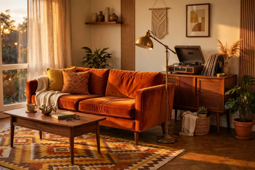

The first apartment I ever rented on my own had gray walls, gray carpet, and exactly one window that faced a brick wall. It looked like the waiting room of a dentist’s office. For months I tried to fix it with cheap posters and a string of fairy lights, and it still looked sad. Then my grandma called and said, “Come take the old wooden cabinet before your uncle throws it out.” That cabinet — walnut, tapered legs, glass sliding doors, smelling faintly of mothballs — changed everything. Once it was in the room, the gray suddenly didn’t look sterile anymore. It looked like a background. That was the day I accidentally discovered retro.
Retro isn’t about turning your apartment into a museum of the 1970s. Nobody wants to actually live in 1974 — the shag carpet hid everything, the wallpaper gave people headaches, and half that furniture was deeply uncomfortable. Real retro apartment style is sneakier and better: you borrow the warmth, the colors, and the character of past decades, and you mix them with the comfort and light you already have. Burnt orange without the brown overload. Mid-century lines with a modern mattress. The result feels collected, cozy, and completely yours — not decorated.
Below are 13 retro apartment aesthetic ideas that actually work in rentals, including small ones. I’ve done most of these myself, messed up a few of them first, and noted exactly where I went wrong so you don’t have to.
1. Pick a Decade-Blended Palette (Don’t Copy One)
The biggest trap with retro decorating is picking a single decade and committing to it wholesale. Full 70s looks like a movie set. Full 50s looks like a diner. The rooms that get saved on Pinterest thousands of times are blends — they steal the best colors from several decades and leave the rest.
The five colors that never fail
Stick to this short list and you basically can’t go wrong: burnt orange, mustard yellow, olive green, walnut brown, and cream. That combination shows up in almost every retro interior that actually looks good. If you want a wildcard, add muted teal — it cools down all that warmth just enough.
Use the three-color rule
Pick three of those colors: one dominant (usually cream or a warm neutral for walls and big surfaces), one secondary (walnut brown or olive for furniture), and one accent (burnt orange or mustard for the fun stuff). When my living room went from gray-dentist-office to retro, all I did was follow this rule: cream walls stayed, walnut furniture arrived, burnt orange showed up in pillows and one throw. Three colors, instant transformation. Add more than three and a small apartment starts looking busy fast.
2. Let One Bold Sofa Do the Talking
If you buy exactly one retro statement piece, make it the sofa. A burnt orange velvet couch with tapered wooden legs will carry an entire living room on its back. I found mine secondhand for less than a month’s coffee budget, and visitors comment on it before they comment on anything else.
Look for clean lines and skinny wooden legs rather than the big, puffy modern shapes — that silhouette is what reads “retro” from across the room. If orange scares you, olive green velvet does the same job with slightly less commitment. Balance a loud sofa with quiet surroundings: cream or beige walls, a simple rug, natural wood nearby. The sofa is the star; everything else is the backup band. When I first got mine, I paired it with a patterned rug, patterned curtains, and patterned pillows all at once, and the room looked like it was arguing with itself. One pattern family per room. That’s the rule I learned the hard way.
3. Add Warm Wood — But Only on One Wall
Nothing says retro quite like wood. But here’s the thing nobody tells you: covering every wall in wood paneling makes an apartment feel like the inside of a cabin, and not in a good way. One warm wood accent wall is plenty. It gives you that mid-century warmth and texture while the rest of the room stays bright.
For renters, peel-and-stick wood slat panels are the cheat code. They go up with adhesive, they come down without a fight, and they look shockingly real once they’re on the wall. Measure the wall, install the panels evenly, keep furniture a few inches away from the wall so the texture reads clearly, and finish with a warm lamp nearby — wood looks ten times better under warm light than under white light. Pair light brown wood with cream furniture, a brass lamp, and one big leafy plant, and you’ve got a corner that photographs like a magazine spread.
4. Round Out the Boxy Lines
Apartments are boxes full of rectangles — boxy rooms, rectangular windows, square tiles. Retro design loves curves, which is exactly why a curved piece of furniture looks so good in a rental: it breaks the monotony instantly.
Start with one or two curved pieces. A round walnut coffee table. A curved velvet accent chair in olive or rust. An oval mirror with a wooden frame. These soft shapes make a room feel welcoming in a way that straight lines never quite manage. The mistake is going all-curves — a room with nothing but round furniture looks like it has no backbone. Keep your sofa and your main storage rectangular, and let the curves be the accents. My setup is a straight sofa, a round coffee table, and an oval mirror, and the balance works.
5. Light It Like It’s 1974 (Warm, Not White)
Lighting changes a retro room more than any furniture ever will. Swap your overhead ceiling light for layers: a floor lamp in one corner, a table lamp on the sideboard, and warm bulbs everywhere. Warm light — think 2700K on the bulb box — makes wood glow, makes orange velvet look richer, and makes people look better too. Bright white bulbs murder the entire mood. I know because I lived with them for four months before a friend asked why my apartment looked like an office.
Brass and smoked-glass lamp bases are the retro sweet spot, and thrift stores are overflowing with them. A dimmer switch is the cheapest upgrade in this whole list — a ten-minute install (or a plug-in dimmer, if your lease is strict) that turns one lamp into five different moods. Put light sources at different heights around the room instead of relying on one ceiling fixture, and the space will suddenly feel deeper and more expensive than it is.
6. Hang a Gallery Wall, Not a Random Wall
A gallery wall only works when it looks intentional. The difference between “curated retro collection” and “I ran out of wall space” is planning. Lay your frames out on the floor first, keep the spacing even, and stick to a tight color palette across the artwork — abstract prints, vintage-style posters, and line art in oranges, creams, and browns will hang together even if the subjects are completely different.
Mix frame sizes for movement, but anchor the arrangement with one oversized statement print surrounded by smaller pieces. Wooden frames beat black metal ones here; the wood ties back into the warm palette. My gallery wall has nine frames and exactly three colors across all the art. When I tried it with five colors, it looked like a bulletin board. Edit ruthlessly — the frame you leave out is doing you a favor.
7. Textiles Are Where the 70s Actually Happens
If you’re renting and can’t paint, textiles are your renovation. A geometric rug in rust, mustard, and cream does more for a retro room than almost anything else — it’s the single biggest pattern surface in most apartments. Start with one large patterned rug, then echo two of its colors in smaller textiles: throw pillows, a knit blanket over the sofa arm, maybe a fabric pouf.
The rule that saved me: mix bold patterns with solid fabrics. A geometric rug plus solid velvet pillows plus one textured throw is a retro room. A geometric rug plus geometric pillows plus a geometric throw plus patterned curtains is a circus. Let one textile be the loud one and keep the rest quiet. Washable covers are worth the small premium — retro colors show everything, and you will spill coffee on that cream pillow. I did. Twice.
8. Give Your Shelves a Personality
Open shelving is where retro apartments earn their “collected over time” feeling. This is the spot for the stuff with a story: a record player on the sideboard, vinyl records leaning in a crate, old cameras, ceramic vases from the flea market, a stack of vintage books with worn spines. Mix in a plant and leave breathing room between objects — empty space is part of the look.
The fastest way to ruin it is overfilling. I once packed a shelf so tight it looked like a yard sale, and no individual piece could breathe. Now I follow the odd-numbers trick: group things in threes and fives, put the biggest item down first, and fill the gaps with small things. If a shelf looks cluttered, take three things off instead of rearranging — subtraction beats organization every time.
9. Don’t Forget the Corners
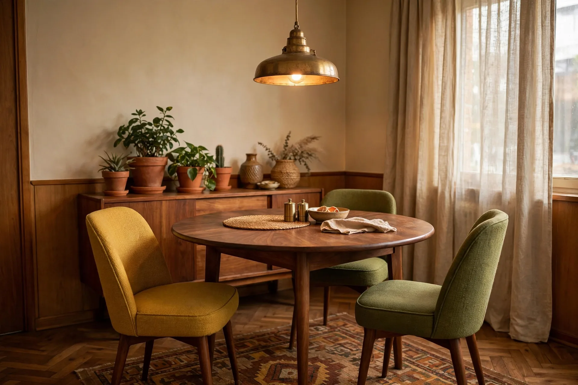
The main rooms get all the attention, but retro charm lives in the corners too. A small dining nook with a round walnut table and two mismatched-but-coordinated upholstered chairs becomes the spot where everyone actually sits. Hang a brass pendant light low over the table — it carves out a “room” without any walls — and add a simple centerpiece like fresh flowers or a ceramic bowl. Even in a studio, that defined corner makes the whole apartment feel bigger and more intentional.
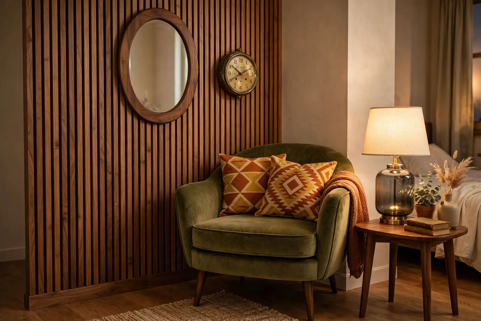
The same goes for an empty bedroom corner. A curved olive velvet chair, a small wooden side table, a warm smoked-glass lamp, and an oval mirror on a wood-slat wall turn dead space into the coziest reading spot in the house. These corners are also the cheapest retro wins — one chair, one lamp, one mirror, done.
10. Plants Are the Cheapest Retro Hack
Big leafy plants were in every stylish 70s interior, and they cost almost nothing compared to furniture. A fiddle leaf fig or a rubber plant next to walnut furniture, with warm light hitting the leaves, is pure retro atmosphere for the price of a takeaway dinner. Put them in terracotta or ceramic planters in earthy colors to keep the vintage thread going.
Buy fewer plants than you think you want, and keep the ones you have healthy. One thriving monstera beats six sad, yellowing ones — neglected plants make any room look tired, retro or not. Rotate them every couple of weeks so they grow evenly, and wipe the leaves occasionally; dusty leaves photograph terribly and the plants genuinely do better clean. I learned that one from a plant-shop owner who looked at my dusty rubber plant with visible pity.
11. Thrift It: My Actual Shopping Playbook
Retro style and thrift stores were made for each other, because the aesthetic literally comes from secondhand decades. Here’s the order I shop in, from best value to worst:
Facebook Marketplace and estate sales first. Solid wood mid-century furniture shows up constantly, usually from people clearing out a parent’s house, and it sells for a fraction of what vintage shops charge. Search “mid century,” “walnut,” “teak,” and “vintage” rather than “retro” — sellers use the furniture terms. Always check that drawers slide and legs are solid before you pay; wobbly is fine, broken is not.
Thrift stores second, for the small stuff. Brass lamps, ceramic vases, vinyl records, wooden frames, and weird little sculptures — this is where accessories come from. Go on weekday mornings when new stock hits the floor. I found my smoked-glass lamp base for the price of a sandwich, and it looks identical to ones selling for forty times more on Etsy.
New only for what touches your body daily. Sofa cushions, mattresses, and anything upholstered that you can’t verify — buy these new or reupholstered. Vintage charm stops being charming when the sofa smells like someone else’s basement. Brands like Article and West Elm do clean mid-century-inspired lines, and IKEA’s Stockholm line is basically retro-adjacent at student prices. One new anchor piece plus thrifted everything else is the formula.
12. Mix Old and New on Purpose
A room that’s 100% vintage looks like a set. A room that’s 100% new looks like a showroom. The magic ratio is roughly 70/30: mostly vintage or vintage-style pieces, with enough modern elements that the room feels livable. Modern lighting, a clean-lined rug, or contemporary art mixed into the gallery wall keeps the whole thing from tipping into costume territory.
This is also the practical answer to the “won’t retro look dated?” worry. It won’t, because you’re not recreating a decade — you’re borrowing its warmth. My TV corner is a walnut sideboard from the 60s holding a very modern television, with a modern soundbar hidden behind vintage books on the shelf above. Old bones, new guts. That’s the whole philosophy in one sentence.
13. Let It Grow Slowly
The most convincing retro apartments were never decorated in a weekend. They accumulated. The record player came from an uncle, the rug from a flea market trip, the brass lamp from a neighbor moving abroad. When you add pieces gradually, the room develops the layered, personal feeling that no shopping spree can fake.
So start with one or two ideas from this list — the palette and the lighting are the highest-impact first moves — and live with them for a while. Notice what the room is missing before you buy anything else. The best retro homes tell the story of the person who lives there, one thrifted treasure at a time. Yours will too.
Mistakes I Made So You Don’t Have To
Orange overload. My first attempt had an orange sofa, orange curtains, orange art, and an orange rug. It looked like the inside of a traffic cone. One orange hero piece per room. Everything else supports it.
White bulbs everywhere. I genuinely didn’t know bulb color temperature was a thing. Switching to warm 2700K bulbs was the single cheapest transformation in this entire article.
Wood on every wall. I got excited about peel-and-stick panels and did two walls. The room shrank visually overnight. One feature wall, always.
Shelf hoarding. Every flea market find does not need to be displayed simultaneously. Rotate your accessories seasonally — the stuff in storage feels “new” when it comes back out.
Buying the aesthetic before the basics. I bought a vintage telephone (decorative, doesn’t work) before I owned a decent lamp. Function first, charm second. The charming stuff is more fun once you can actually see it.
Final Thoughts
My gray dentist-office apartment is long gone, but grandma’s walnut cabinet moved with me to every place since. It’s scuffed, one sliding door sticks, and it still smells faintly of mothballs if you get close. It’s also the piece every guest asks about, and it’s the reason my current place feels like mine instead of like a rental.
That’s really what the retro apartment aesthetic is: permission to fill your space with things that have warmth and history instead of things that match. Start with the palette, fix the lighting, find one piece with a story, and let the rest accumulate. Then send me a photo of your corner — I want to see what you find.