
Three years ago I stood in my kitchen at midnight, staring at a cabinet door I’d just painted, and thought I’d made a terrible mistake. The color looked perfect in the store. On my cabinets, under my lights, it looked like something from a hospital waiting room.
That was my first cabinet repaint. I sanded too little, skipped the primer on half the doors (don’t ask), and picked a color based on a two-inch swatch. I lived with that kitchen for eight months before repainting it properly. The second time, I did my homework — and the difference was honestly shocking. Same cabinets, same layout, completely different room.
That experience taught me the two things nobody tells you about painted kitchen cabinet color ideas. First: the color matters less than how it behaves in YOUR kitchen, with your light, your floors, your counters. Second: preparation is 80% of the result. A beautiful color over a bad prep job still looks bad.
So here are 13 painted kitchen cabinet color ideas that genuinely work, drawn from what I’ve painted myself, what I’ve seen hold up in friends’ kitchens over the years, and the paint colors professionals keep coming back to. I’ll give you real paint names (Sherwin-Williams and Benjamin Moore, mostly — they’ve earned their reputation on cabinets), plus exactly how to prep so the paint actually lasts.
13 Painted Kitchen Cabinet Color Ideas That Actually Work
1. Sage Green
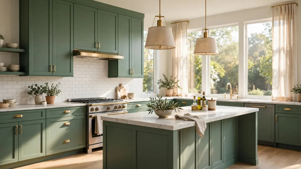
Sage green is the color I ended up with after my failed first attempt, and I’ve never regretted it. It’s the rare color that feels fresh without being loud. Sherwin-Williams Evergreen Fog (SW 9130) is the one designers can’t stop talking about — a soft, grayed green that changes beautifully through the day. Benjamin Moore Saybrook Sage (HC-114) is another classic in this family.
What makes sage work is that it plays well with everything: white counters, wood floors, brass pulls, black hardware. If your kitchen gets warm afternoon light, sage will pick up a golden glow that’s genuinely lovely. It also hides fingerprints and minor wear better than white, which matters if you actually cook.
2. Deep Navy Blue
Navy is the bold move that somehow never goes out of style. Hale Navy (HC-154) by Benjamin Moore is probably the most-painted cabinet color of the last decade, and for good reason — it reads as sophisticated rather than trendy. In a kitchen with good natural light, navy cabinets with brass hardware look straight-up expensive.
The practical upside nobody mentions: navy hides everyday grime remarkably well. The area around your handles and the toe-kick will show far less wear than they would on white. My one warning — in a dark kitchen with one small window, navy can feel heavy. Pair it with white counters and a light backsplash, and even smaller kitchens pull it off.
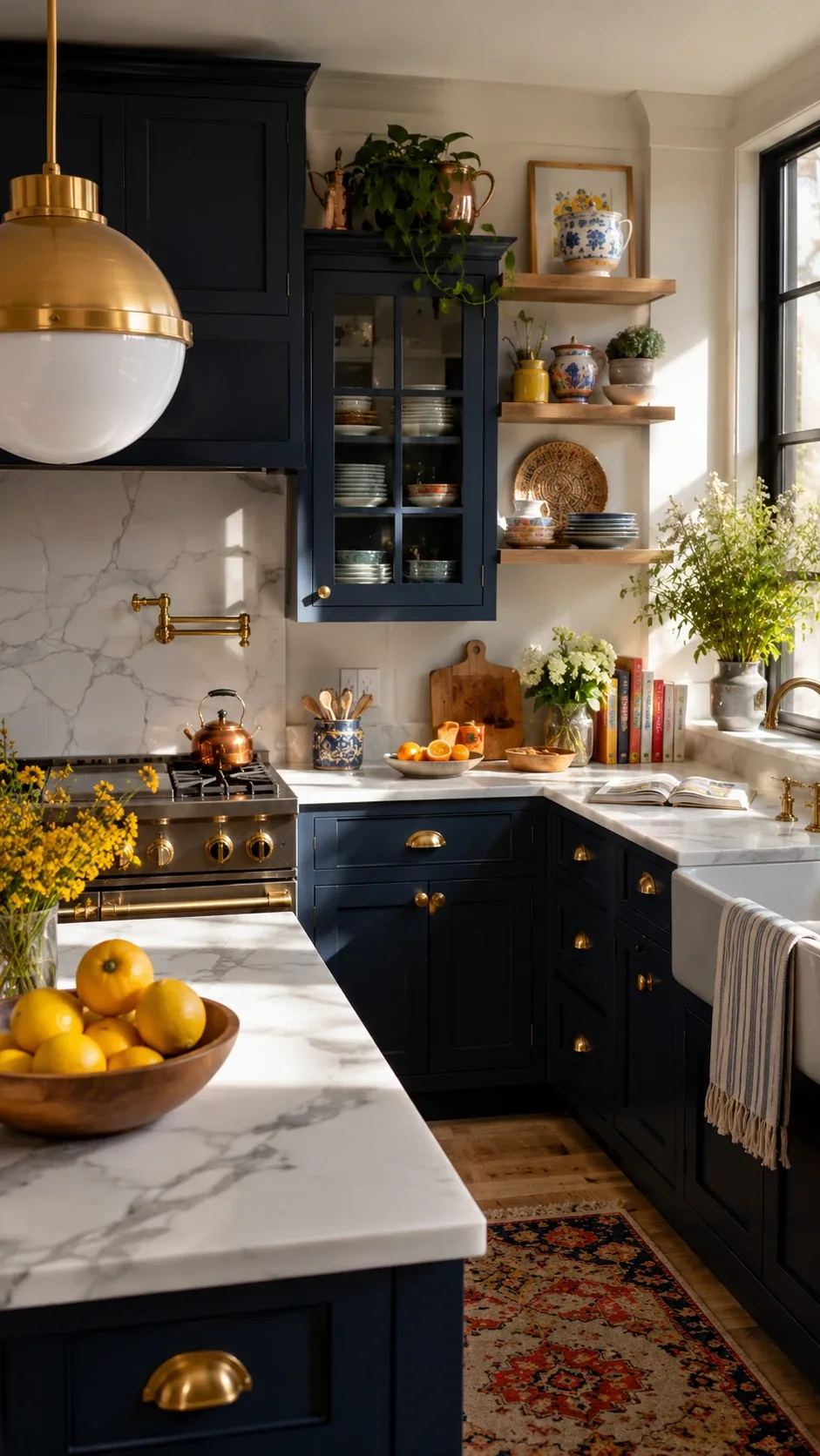
Image credit: homedishy.com
3. Soft Cream
If bright white feels too stark for your taste, cream is your answer. Benjamin Moore White Dove (OC-17) is technically an off-white with warm undertones, and it’s the most forgiving cabinet color I know. It softens a kitchen instantly without committing you to any color family.
Cream is also the safest choice for resale — buyers universally like it. I watched a friend paint her rental kitchen in a cream that cost her about $200 in paint, and her landlord literally raised the rent by $150 a month. Not that I’d recommend telling your landlord.
4. Charcoal Gray
Charcoal gives you the drama of black without quite the commitment. Sherwin-Williams Iron Mountain (SW 7069) is a charcoal with warm undertones that stops it from reading blue in cool light — that’s the trap with cheap charcoals, they skew blue-gray and look odd. Benjamin Moore’s Chelsea Gray (HC-168) is another warm option.
Here’s my honest take: charcoal looks incredible in open-concept homes where the kitchen needs to hold its own against a big living space. In a tiny galley kitchen with no windows, it can close the walls in. Test a large sample board first — a full door-size sample, not a chip.
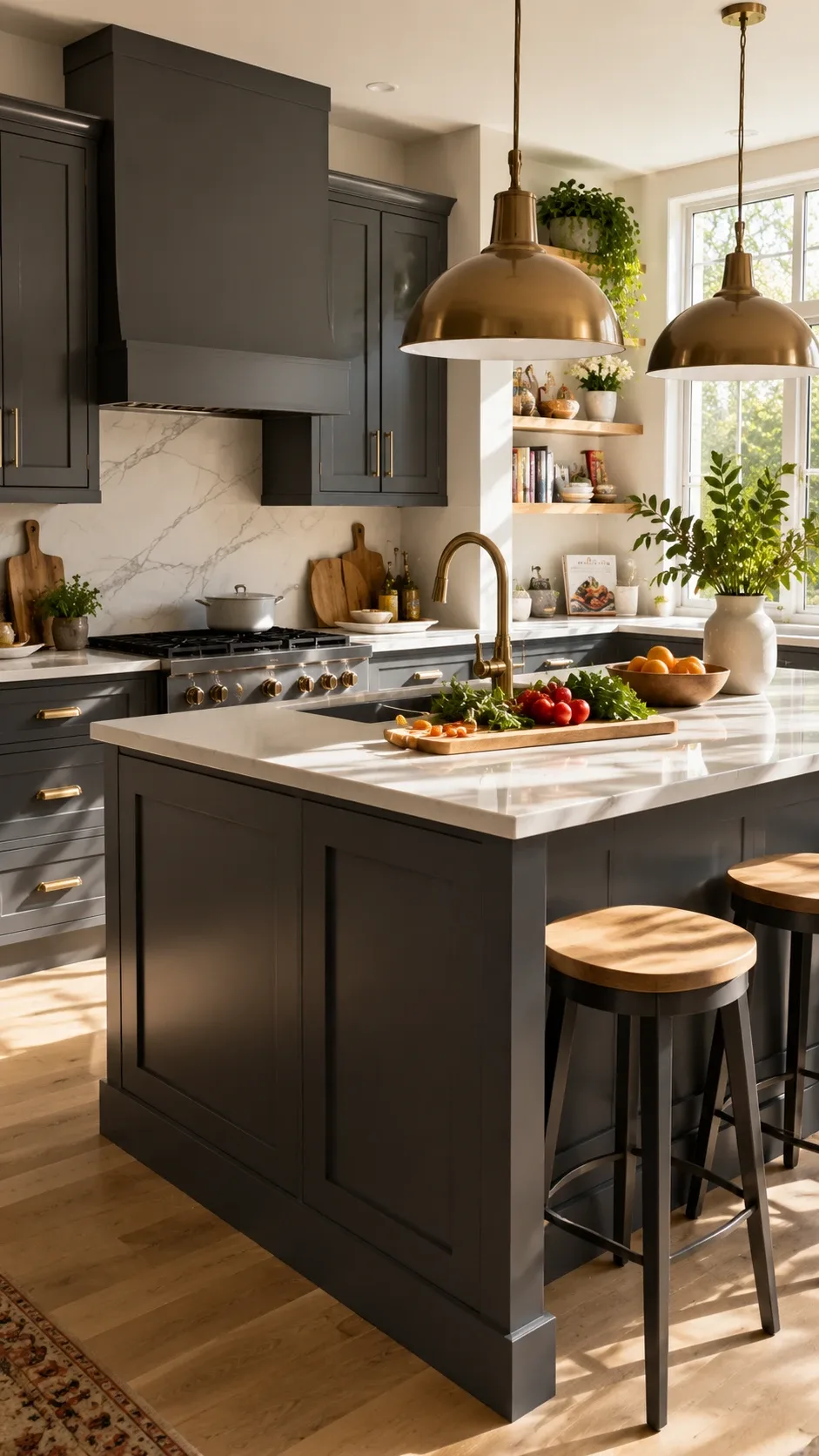
Image credit: homedishy.com
5. Dusty Blue
Dusty blue is what you pick when you want color but you’re scared of color — and I mean that as a compliment. It’s muted, it’s calm, it goes with white, wood, stone, pretty much anything. Benjamin Moore Boothbay Gray (HC-165) sits right in this family, that lovely gray-blue that coastal kitchens have made famous.
I painted a bathroom vanity in a dusty blue years ago and it’s the one paint job I’ve never wanted to change. In kitchens, it has this gentle quality that makes mornings feel calmer. Weird thing to say about a paint color, but ask anyone who has it.
6. Warm Taupe
Taupe is the color people discover after trying gray and finding it cold. It’s the middle ground — warm enough to feel cozy, neutral enough to disappear into any style. Sherwin-Williams Accessible Beige (SW 7036) became famous for a reason: it works in every light condition without turning pink or yellow, which is where most beiges fail.
The practical case for taupe: it’s the most adaptable color on this list. When you change your backsplash, your hardware, your barstools — taupe just absorbs it. If you hate committing, this is your color.
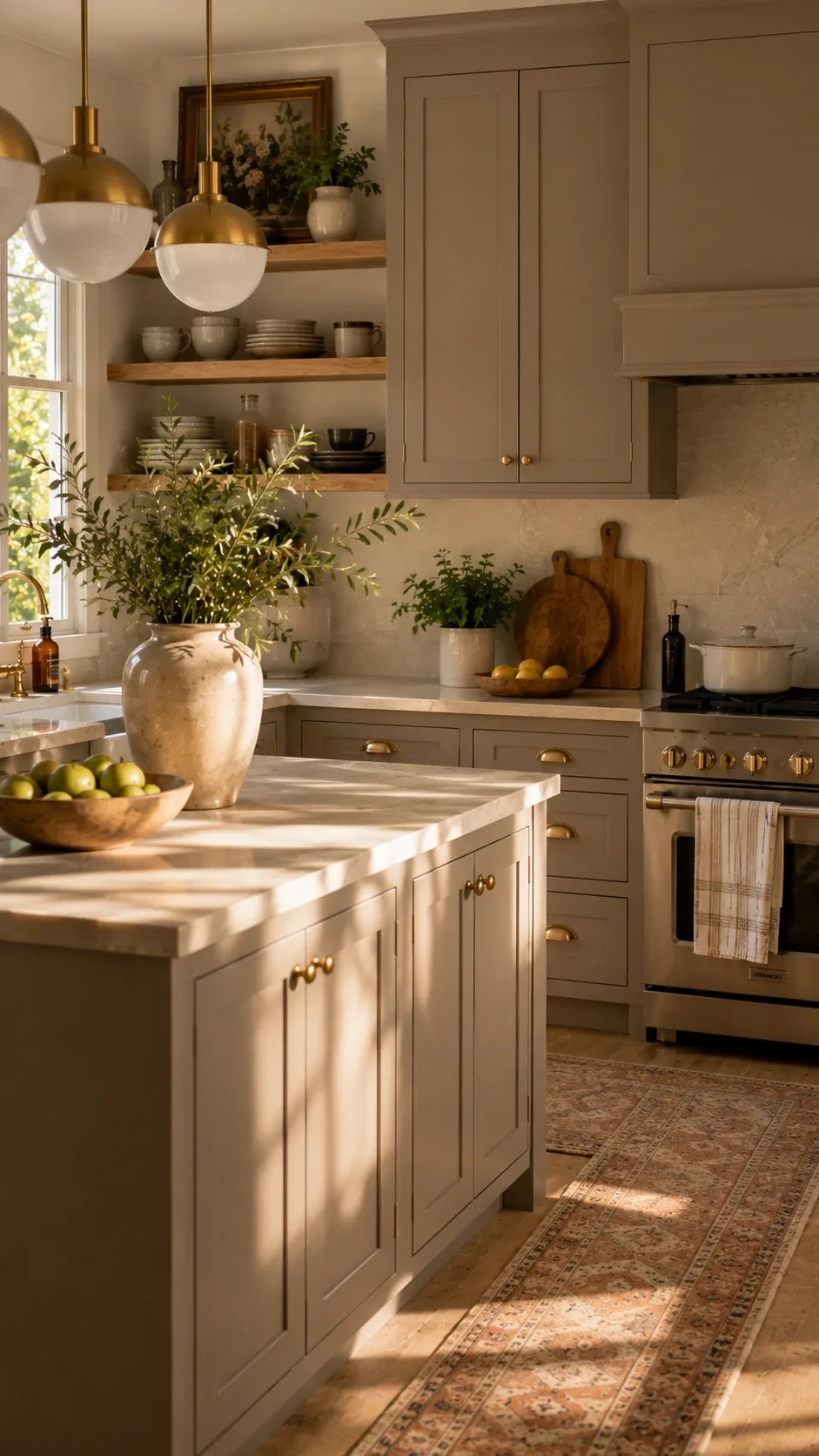
Image credit: homedishy.com
7. Forest Green
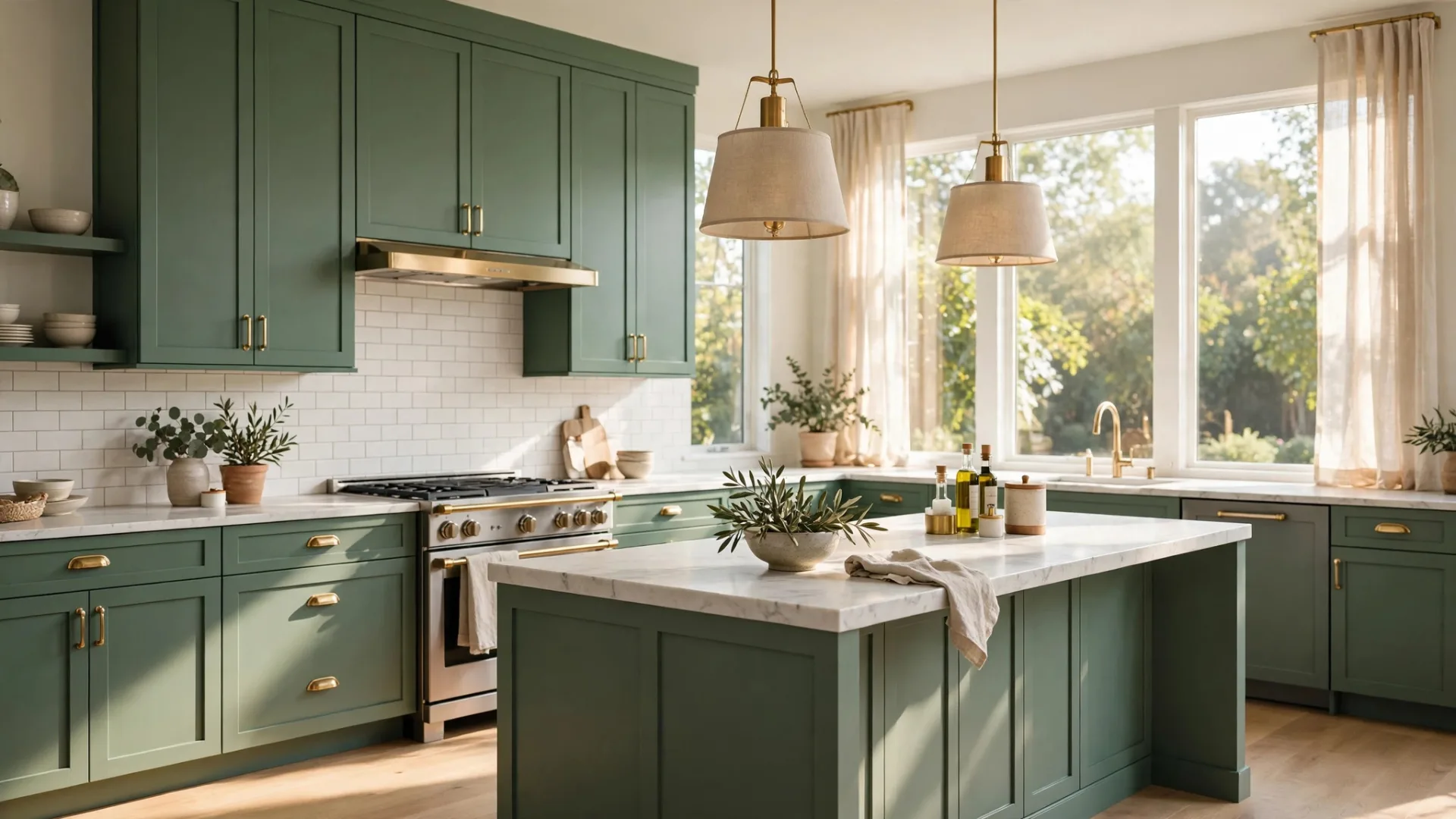
Forest green is the grown-up version of sage. Richer, deeper, more dramatic — and honestly, the color that makes guests stop mid-sentence and ask about it. Sherwin-Williams Rookwood Shutter Green (SW 2809) or Benjamin Moore Essex Green (HC-188) are the heavyweights here.
This color demands one thing: good light. In a bright kitchen with wood floors, forest green cabinets look like a custom kitchen that cost six figures. In a dark one, they can swallow the room. It also pairs gorgeously with marble — the veining picks up the green in a way that’s almost artful. Brass hardware is non-negotiable here; silver tones fight the warmth.
8. Greige
Greige — the gray-beige hybrid — is probably the single most requested cabinet color at paint counters, and it earns it. Benjamin Moore Revere Pewter (HC-172) is the legendary one: light, warm-gray that somehow works with everything from oak floors to white quartz.
My advice with greige is to go one shade deeper than you think. The light greiges can wash out under bright kitchen lighting and end up looking like nothing at all. A mid-tone greige gives you that soft contrast against white counters that makes a kitchen look professionally designed.
9. Muted Terracotta
Okay, this is the wild card, and I love it. Muted terracotta — not orange, not pink, that earthy sun-baked clay tone — gives a kitchen instant warmth and personality. Sherwin-Williams Cavern Clay (SW 7701) is the famous one from their color of the year moment, and it photographs beautifully.
This is not the color for everyone, and that’s the point. In a kitchen with handmade tile, wood shelves, and natural materials, terracotta cabinets look like something from a Spanish villa. If your kitchen is all stainless steel and white subway tile, skip it — the context has to be right.
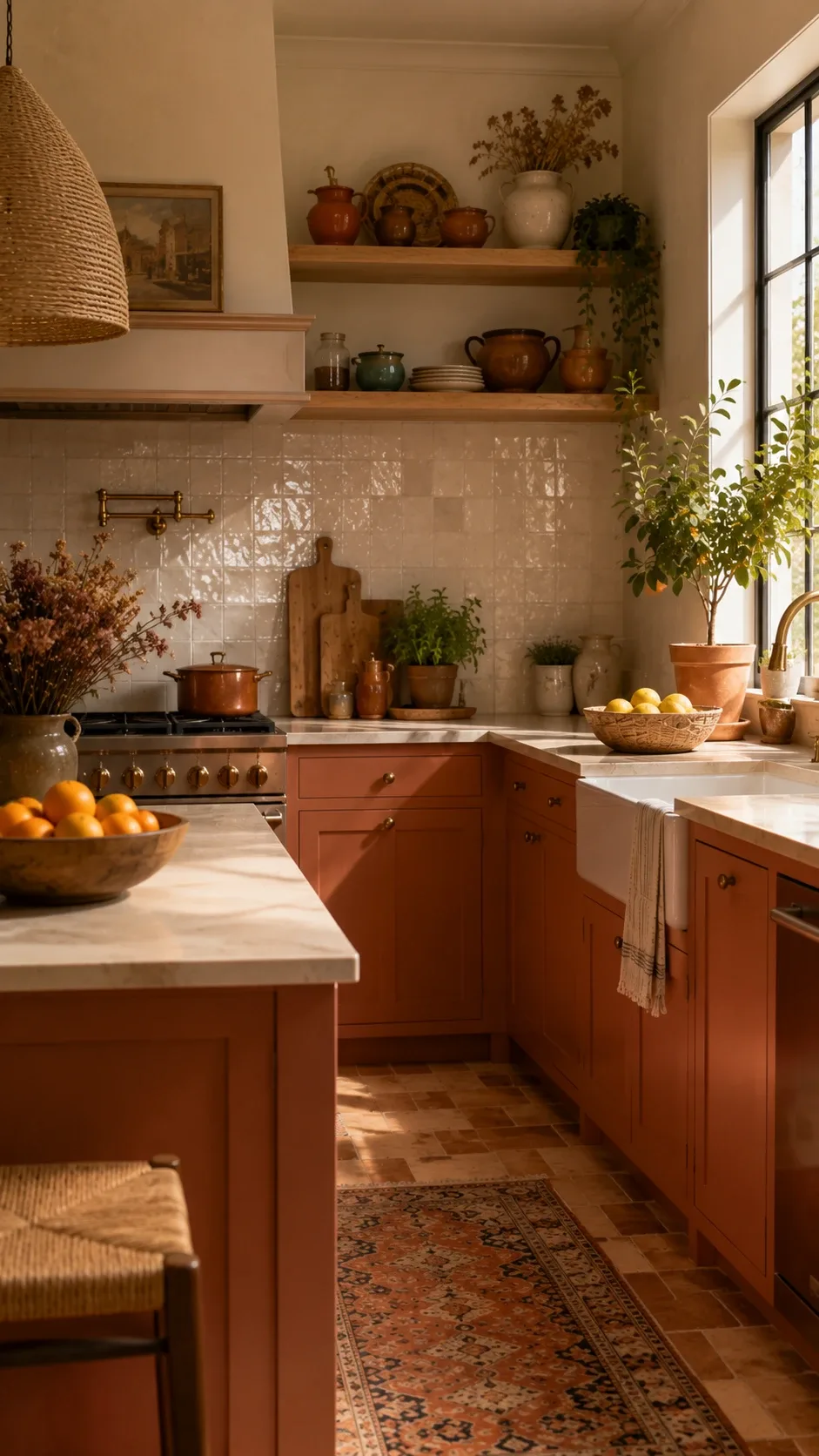
Image credit: homedishy.com
10. Matte Black
Black cabinets are the power move. They look custom, expensive, and completely intentional — when they’re done right. The secret is sheen: matte or satin black reads as sophisticated, while glossy black can look like a teenager’s bedroom. Benjamin Moore Black Beauty (2128-10) or Sherwin-Williams Tricorn Black (SW 6258) are the go-tos.
You need two things for black cabinets: excellent lighting and contrasting surfaces. White or light stone counters are essential, and under-cabinet lighting stops the uppers from becoming a black void. When those two are in place, black cabinets are genuinely stunning — and they hide absolutely everything.
11. Pale Blue
Pale blue is the color that makes small kitchens feel bigger. It reflects light almost like white, but with actual personality. Benjamin Moore Palladian Blue (HC-144) is a soft blue-green that’s been a favorite for years, and it has this quality of changing through the day — bluer in morning light, greener in the evening.
This is the color I’d recommend to anyone with a small, dark-ish kitchen who can’t decide. It brightens, it adds character, and it’s nearly impossible to get wrong. I’ve never seen a pale blue kitchen that looked bad.
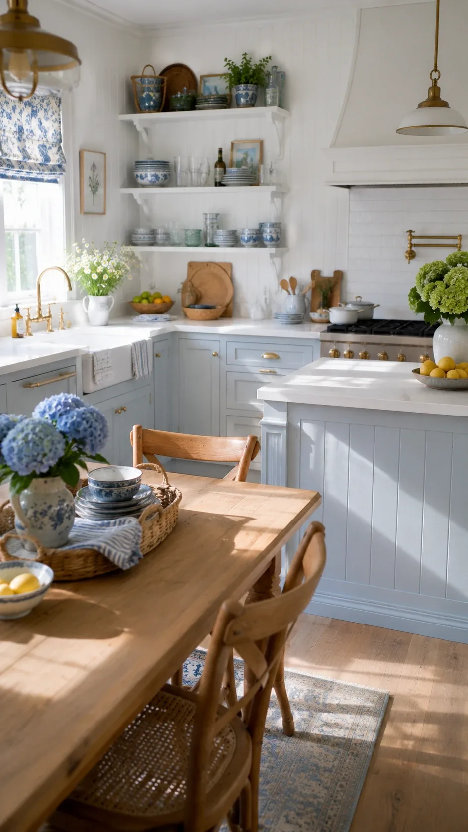
Image credit: homedishy.com
12. Mushroom Gray
Mushroom gray is having a moment, and unlike most moments, this one deserves it. It’s a gray with brown undertones that feels warm and organic — the opposite of the cold, industrial grays that dominated the 2010s. Sherwin-Williams Amazing Gray (SW 7044) or Benjamin Moore Stone Hearth (CC-490) live in this family.
Mushroom is the sophisticated neutral nobody can quite place, which is why it photographs so well for listings and looks high-end in person. It pairs especially well with brushed nickel or unlacquered brass, and with natural stone counters that have warm veining.
13. Rich Burgundy
Burgundy is the boldest color on this list and the one I’m most excited about. Deep wine tones — think Sherwin-Williams Black Cherry (SW 6279) or a custom deep oxblood — give a kitchen a rich, moody warmth that no other color delivers. It feels European, collected, expensive.
The trick with burgundy is balance. Keep walls, counters, and backsplash light and let the cabinets be the star. I’ve seen this work beautifully on an island only, with cream perimeter cabinets — a two-tone approach that gives you the drama without overwhelming the room. If you’re going to paint just the island, burgundy is my top pick.
How to Paint Kitchen Cabinets So the Paint Actually Lasts
Here’s the uncomfortable truth: the color is maybe 20% of a cabinet paint job. The other 80% is prep and product. I learned this the hard way (remember the hospital-waiting-room doors?). Here’s the process that actually holds up, step by step.
Step 1: Clean Like You Mean It
Cabinets accumulate years of cooking grease, and paint will not stick to grease — ever. Remove the doors, drawers, and all hardware, then scrub every surface with a degreaser. TSP substitute or Krud Kutter both work well. If the water on your sponge doesn’t bead up anymore, you’re clean enough.
Step 2: Sand Properly
You don’t need to sand down to bare wood, but you do need to scuff every glossy surface. Use 150-grit sandpaper on the frames and 180-220 grit on the doors. The goal is a uniform dull finish with no shiny spots. This is the step most people rush, and it’s the step that determines whether your paint peels in six months.
Step 3: Prime With the Right Primer
For cabinets, a bonding primer is non-negotiable. My go-to is Zinsser BIN Shellac-Based Primer — it sticks to everything and blocks stains and wood tannin bleed-through. Yes, it smells terrible and you need ventilation. It’s worth it. One full coat, then a light sand with 220-grit when dry.
Step 4: Use Actual Cabinet Paint
This is where I went wrong the first time — I used regular wall paint. Don’t. Cabinet paints are formulated to level out (fewer brush marks) and cure harder. The two names that keep coming up for a reason: Benjamin Moore Advance and Sherwin-Williams Emerald Urethane Trim Enamel. Both are excellent. Expect two thin coats rather than one thick one.
Step 5: Let It Cure — Really
Paint feels dry in hours but takes days to cure hard. Wait at least a full week — ideally two — before reattaching hardware and loading the cabinets up. The paint on my first attempt never fully cured because I rushed it, and doors started sticking to frames within a month. Patience is genuinely part of the product.
Mistakes to Avoid (I Made Most of These)
- Picking a color from a tiny swatch. Buy a quart, paint a full door or a large foam board, and live with it for three days. Light changes everything.
- Skipping primer. Paint peels off unprimed cabinets. There’s no shortcut, and the “paint and primer in one” products aren’t enough for cabinets.
- Painting in high humidity. Cabinets painted on a humid day can stay tacky for days and never level properly. Pick a dry week.
- Using a cheap brush. A good angled sash brush and a small foam roller make a visible difference. Budget brushes leave visible strokes.
- Rehanging doors too early. This one bit me. Wait the full cure time. A stuck door rips paint right off the frame.
Quick FAQs
What is the most timeless cabinet paint color?
Soft cream, navy blue, sage green, and greige have the longest track record. They’ve looked good for decades and there’s no sign of that changing.
Should cabinets be painted lighter or darker than walls?
There’s no rule, but contrast looks best. If your walls are white, almost any cabinet color works. If your walls are dark, lighter cabinets keep the kitchen from feeling like a cave.
Do painted cabinets last?
Yes — with proper prep, a bonding primer, and quality cabinet paint, they hold up for many years of daily use. The prep matters more than the color.
Is it better to paint or replace kitchen cabinets?
If the cabinets are structurally sound — solid boxes, working hinges — painting costs a fraction of replacement and can look just as good. Replacement only makes sense when the layout or the boxes themselves are the problem.
Final Thoughts
My kitchen is sage green now, and every time I walk in I remember that midnight moment staring at the wrong color. The prep took a weekend and about $300 in supplies, and it changed the room more than anything else I’ve ever done in this house.
If you’re on the fence, start with the island or the lower cabinets. It’s less commitment, less work, and two-tone kitchens look great anyway. Pick your color with a big sample board, do the prep properly, use real cabinet paint — and give it the cure time it needs. Your future self will thank you.