
I’ll be honest: burgundy scared me for years. In my head it lived in two places — old-fashioned dining rooms with heavy curtains, and those moody hotel lobbies that look amazing in photos but feel like you’d need permission to sit down. It was not, in my mind, a color for an actual bedroom where an actual person sleeps, reads, and occasionally eats cereal at midnight.
Then my friend repainted her guest room. She’d gone with a deep wine-red on one wall, and when I walked in, I just stood there. It didn’t feel dark or heavy at all. It felt like being wrapped in a warm blanket — cozy, a little dramatic, grown-up in the best way. I went home, ordered a burgundy throw blanket that same night “just to test it,” and reader, that throw never left. Two years later, my whole bedroom revolves around that color, and I have opinions now. Strong ones.
So here are 13 burgundy bedroom ideas I’ve either tried myself, talked a friend into trying, or quietly screenshotted at 1 a.m. Every one of them works in a real bedroom — not a magazine set — and I’ll tell you exactly where I messed up along the way.
The Only Rule That Matters With Burgundy
Before we get into the ideas, there’s one principle that makes or breaks every burgundy bedroom: treat it like a strong spice, not the main ingredient. Burgundy is deep and visually heavy, so it does its best work when it has plenty of breathing room — cream walls, warm wood, soft light. The rooms that go wrong are the ones where someone paints all four walls, buys burgundy curtains, a burgundy rug, AND burgundy bedding in one weekend. Ask me how I know. (The throw blanket phase. We don’t talk about the throw blanket phase.)
Start with one big burgundy moment — a wall, a headboard, the bedding — and let everything else stay quiet. You can always add more. Taking burgundy away is much harder, especially if it involves a paint roller.
13 Burgundy Bedroom Ideas Worth Stealing
1. The Single Burgundy Accent Wall
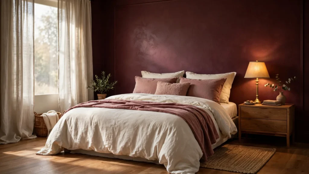
This is the gateway drug, and I say that with love. Painting just the wall behind your bed burgundy gives you all the drama with none of the cave vibes. I did this in my room with a muted wine shade, and the first morning I woke up to it, the whole room felt warmer — like the wall was giving off heat. Keep the other three walls warm white or cream, and use painter’s tape like your life depends on it. Two thin coats, not one thick one; thick coats of dark paint show every roller mark. My mistake the first time: I skipped primer because I was impatient, and the old pale-blue paint underneath made the burgundy look patchy for weeks until I redid it properly.
2. A Burgundy Velvet Headboard
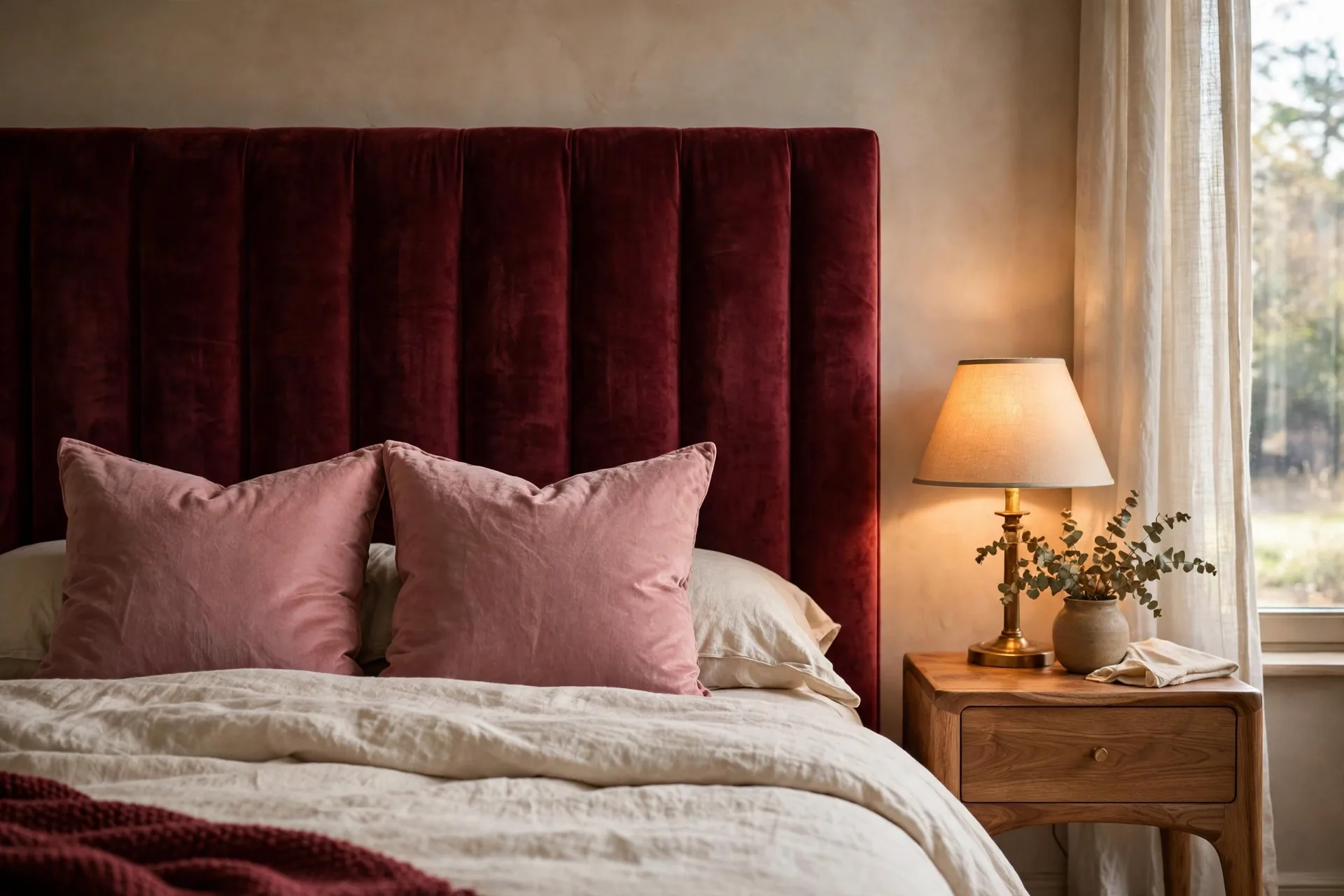
If paint feels too permanent, a velvet headboard is your answer. I talked my sister into this one for her rental — a tall, simple burgundy velvet headboard against plain white walls — and it completely transformed her boring box of a room without a single drop of paint. Velvet is magic with burgundy because the fabric catches light differently across its surface, so the color looks alive instead of flat. Go for a tall, clean shape; lots of tufting and buttons can tip it from “boutique hotel” into “Victorian fainting couch.” Pair it with cream or beige bedding and let the headboard be the star.
3. Burgundy Bedding With Warm Wood Furniture
There’s something about burgundy and wood together that just works — the wood keeps the red from feeling too formal, and the red makes plain wood furniture look expensive. My bed frame and nightstands are a medium oak, and when I switched to a burgundy duvet, the whole set suddenly looked intentional instead of “whatever was on sale.” If your furniture is very dark wood, lighten up everywhere else (cream sheets, pale rug) or the room starts feeling like a library after closing time. Keep the wood tones consistent across your big pieces; mismatched wood plus a strong color reads as clutter.
4. Layered Burgundy Bedding (Not One Flat Duvet)
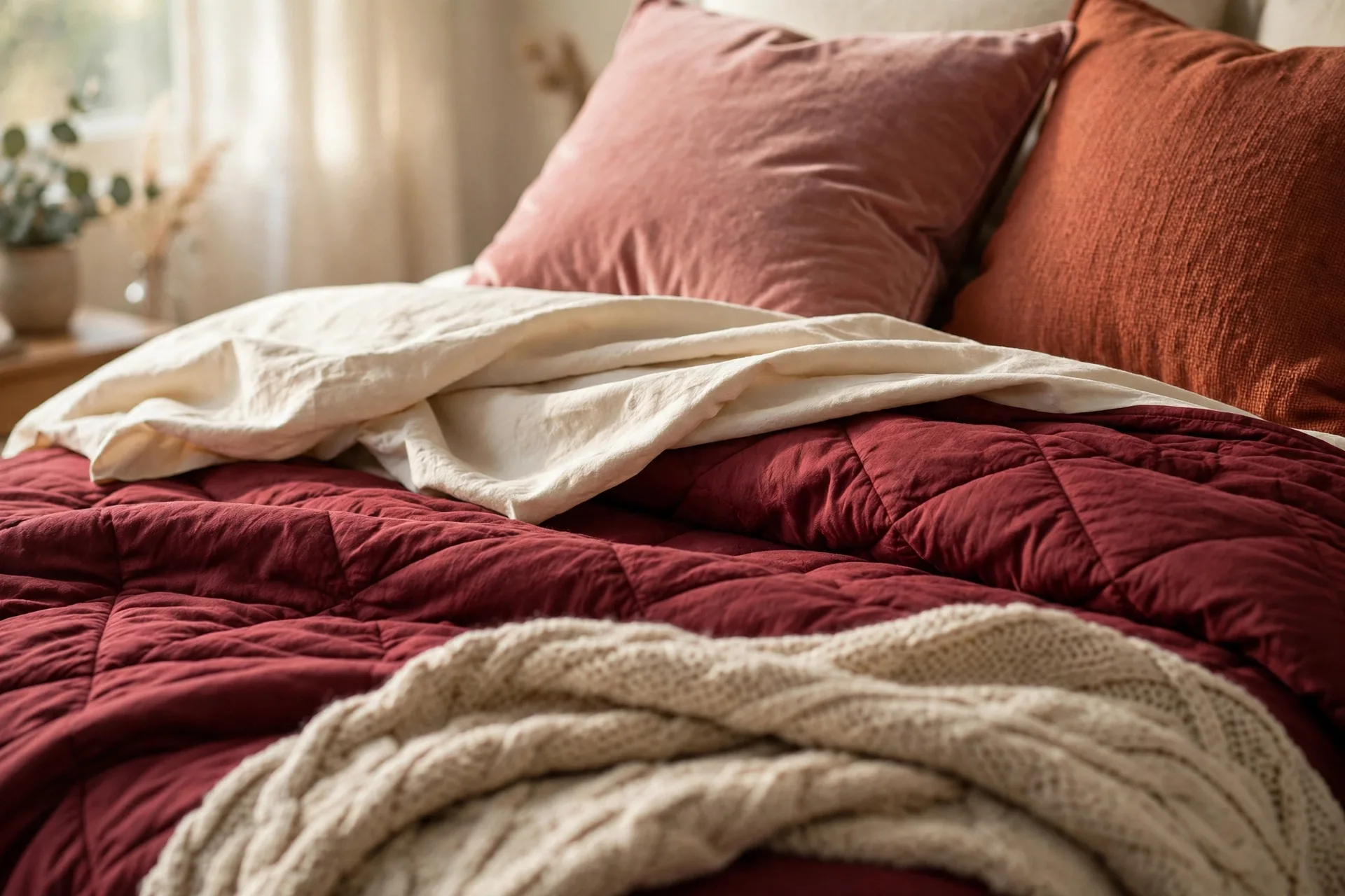
Here’s the difference between a bed that looks “burgundy” and a bed that looks incredible: layers. Instead of one solid burgundy comforter, stack related shades — a burgundy quilt, cream sheets, a dusty-rose pillow or two, a rust or brownish-red throw folded across the foot. I rebuilt my bed this way last fall and guests literally comment on it now. Mix textures more than patterns: linen, cotton, velvet, a chunky knit. A monochromatic burgundy bed in all one fabric looks flat; the same colors in four different textures look rich. Bonus: when seasons change, you just peel off a layer instead of rethinking the whole room.
5. Burgundy Curtains for a Softer Statement
Curtains are the low-commitment way to get a big color payoff. I hung burgundy linen-look panels in my bedroom last spring, and they frame the window so beautifully that the whole room feels more finished — like it got dressed up. They work best when your walls stay light; the contrast is what makes them sing. Hang the rod a good 4-6 inches above the window frame and let the panels kiss the floor. Panels that hover awkwardly above the floor make even expensive curtains look cheap, and I’d rather you hear it from me than discover it in photos later. Repeat the burgundy once more somewhere small — a pillow, a piece of art — so the curtains don’t look lonely.
6. Burgundy With Cream and Brass
If you want the grown-up, pulled-together version of this trend, the formula is burgundy plus cream plus a little brass. Cream keeps the palette light, brass adds warmth and a bit of shine. The trick is proportion: cream should dominate, burgundy should support, and brass should just show up in small doses — a lamp, a mirror frame, new drawer pulls. I swapped my nightstand hardware for simple brass pulls (a $15 upgrade) and the burgundy bedding suddenly looked twice as fancy. Stick with warm, brushed brass rather than shiny yellow gold if you want cozy instead of flashy.

7. A Burgundy Painted Ceiling (Yes, Really)
Okay, hear me out. I haven’t done this one myself yet, but my neighbor did it and I think about her bedroom weekly. A burgundy ceiling with pale walls creates this cocoon feeling that’s hard to describe — the room feels hugged. It works because the ceiling is the only big burgundy surface, so it reads as intentional design, not an accident. If you try it: test the paint under your actual bedroom lighting first, because deep reds shift wildly between daylight and warm bulbs. What looks like rich wine at noon can look almost brown under a cool white bulb at night. Keep the ceiling fixture simple so it doesn’t fight the color.
8. A Burgundy Gallery Wall
For commitment-phobes, art is the answer. I built a small gallery wall over my dresser using prints in burgundy, wine, rust, cream, and muted pink — thrifted frames, mismatched on purpose. It took an afternoon and zero paint. The secret is a controlled color relationship: the pieces shouldn’t match, but they should all speak the same language. Lay everything on the floor first and shuffle until it feels balanced, then hang the biggest piece near the center and build outward. And leave breathing room between frames — a cramped gallery wall makes a bedroom feel busy instead of calm.
9. A Burgundy Bench at the Foot of the Bed
This one earns its keep twice: it adds color and it’s genuinely useful. I found a slim burgundy velvet bench secondhand, and it became the spot for everything — sitting to put on shoes, draping tomorrow’s outfit, stacking the throw pillows I dramatically remove every night. For smaller rooms, pick a bench with visible legs rather than a bulky storage ottoman; seeing floor underneath keeps the room feeling open. One styling rule: keep the top mostly clear. A bench buried under six pillows and three folded blankets stops being furniture and starts being a laundry pile with legs.
10. Burgundy With Dusty Pink Accents
This combo surprised me the most. I’d always thought of pink and burgundy as clashing, but dusty rose and blush tones actually soften burgundy beautifully — they bridge the gap between the deep red and your neutrals so the whole palette feels layered. The key is keeping the pink muted: dusty rose, mauve, blush. Bright bubblegum pink next to burgundy looks like a Valentine’s Day explosion. I added two dusty-pink pillow covers to my burgundy bedding and a warm beige throw between them so the colors don’t touch directly. It reads romantic without being sugary, and it’s the version of this trend I’d recommend to anyone who finds all-burgundy a bit serious.
11. Moody Burgundy and Charcoal
When I want to feel like I’m sleeping in a boutique hotel, this is the palette. Burgundy plus charcoal is dramatic and sophisticated, but fair warning: two deep colors in one room demand good lighting. I tried charcoal curtains with my burgundy bedding for a month, and with just the overhead light on, the room felt like a cave. The fix was two warm bedside lamps and keeping my bedding mostly cream so there was still lightness somewhere. Pick one color to dominate — burgundy on the bed, charcoal in the rug or an accent chair — and let the other one whisper. Done right, this is the most atmospheric bedroom on the list.
12. Painted Burgundy Nightstands
The cheapest idea here, and honestly one of my favorites. I took two sad beige nightstands I was about to donate, sanded them lightly, primed, and painted them a deep burgundy — and they look like completely different furniture. Small painted pieces are the perfect experiment because they take an afternoon and a sample pot of paint. Use proper furniture paint and prep glossy surfaces well, or it’ll chip within months (I learned this on a dresser in 2021 and I’m still bitter). Swap the old hardware for brass or matte black pulls once the paint cures, and keep your bedding quiet so the nightstands look intentional instead of random.
13. Burgundy With Natural Textures
If you love burgundy but not the formal, dramatic side of it, natural textures are your bridge. Woven baskets, linen bedding, a jute rug, rattan details, lightly finished wood — these materials relax the color and make it feel earthy instead of fancy. My current bedroom leans this way: burgundy quilt, cream linen sheets, a jute rug, and a woven basket holding extra throws. It feels collected and calm, not decorated-to-death. Let the natural materials stay a little imperfect — their texture variation is exactly what keeps a strong color like burgundy from feeling stiff.
The Mistakes I Made (So You Don’t Have To)
Every one of these I learned the hard way:
- Going burgundy everywhere at once. Wall, curtains, rug, bedding — all in one weekend. The room felt like the inside of a jewelry box. One big burgundy moment at a time.
- Skipping primer under dark paint. The old wall color ghosted through and I had to do the whole wall twice. Primer is boring and non-negotiable.
- Forgetting about lighting. Burgundy eats light. If your room is already dim, add warm lamps before you add more burgundy, not after.
- Matching everything. Burgundy curtains + burgundy pillows + burgundy rug in the exact same shade looks like a showroom. Vary your shades and textures.
- Choosing the wrong undertone. Burgundy leans either brown-red or blue-red. Hold swatches next to your existing furniture — a blue-red burgundy next to warm orange wood can look off.
- Ignoring the ceiling and trim. Crisp white or cream trim against a burgundy wall is half the look. Dingy trim ruins it.
Paint Shades Actually Worth Swatching
If you’re going the paint route, don’t just grab the first “burgundy” on the shelf — the shade matters enormously. I swatched five before choosing. Look at deep wine reds from brands like Farrow & Ball (their Brinjal is a gorgeous deep aubergine-red) and Benjamin Moore, and always test a large swatch on the actual wall. Paint a poster board and move it around the room at different times of day; a shade that looks perfect at noon can feel completely different at 9 p.m. under lamplight. Muted, slightly brown burgundies tend to feel calmer and more livable than bright cherry-reds, which can feel energizing in a way you don’t want at bedtime.
Final Thoughts
Two years after that impulse throw blanket, burgundy is still my favorite color in my home — and I say that as someone who repainted her living room three times in one year. It has this rare quality of feeling both bold and comforting at the same time. You don’t need to commit to burgundy everywhere; sometimes a velvet headboard, a stack of layered bedding, or one confident accent wall is all it takes to make your bedroom feel like somewhere you actually want to be.
Start with the idea that fits what you already own, live with it for a week, and see how it makes you feel in the morning. That’s the real test — not the photo, the 7 a.m. feeling. If you try any of these, I’d love to hear which one won you over.