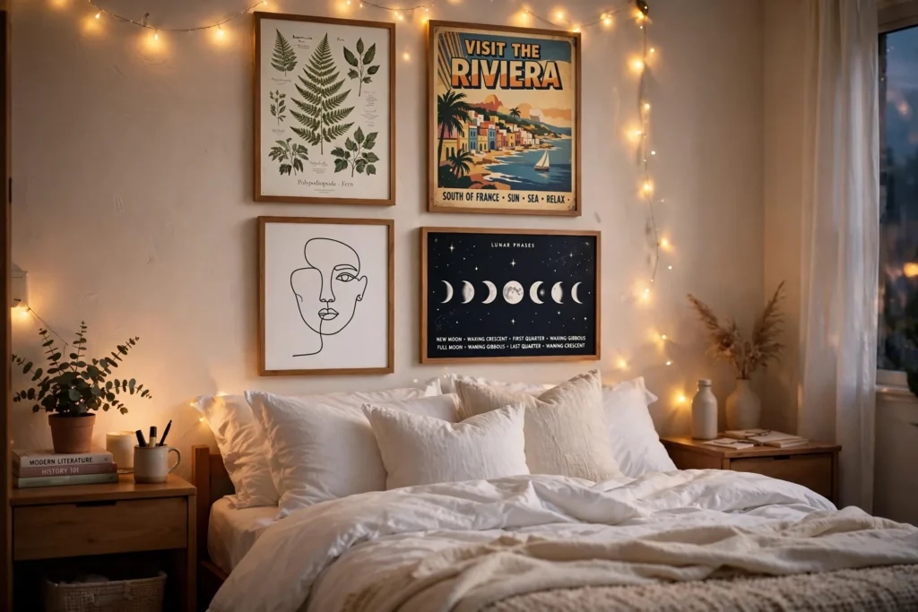

My first dorm room looked like a dentist’s waiting room. White cinderblock walls, a plastic mattress, one flickering overhead light, and absolutely nothing that told anyone who lived there. By the second week I was homesick in a way that had nothing to do with missing my family and everything to do with the fact that my room felt like it belonged to nobody. So I did what every broke college student does: I printed a bunch of random stuff from the library printer, stuck it up with whatever tape I had, and called it decor. Within a month, half of it had curled off the wall, one poster had slid down and stuck to my laptop, and my RA informed me that the masking tape I’d used had bonded with the paint in a way that was going to cost me part of my deposit.
That was a rough lesson, but it taught me something useful: posters are hands-down the best way to make a dorm room feel personal, because they’re cheap, they don’t need nails or paint, and you can change them whenever your taste changes (which, in college, is about every four months). I’ve now done this in three dorms and two tiny apartments, and I’ve figured out what actually works, what falls off the wall at 2 a.m., and which poster looks will make your room the one everyone wants to hang out in. These 13 dorm wall decor poster ideas are all renter-friendly, all budget-friendly, and all tested by someone who has personally peeled Command strips off a wall at midnight before an RA inspection.
Why Posters Beat Every Other Kind of Dorm Wall Decor
Before we get into the ideas, let me make the case quickly. Posters are light, which means you can hang them with removable adhesive strips or even washi tape without drilling a single hole. They’re cheap — you can print a set of ten art prints at a campus print shop for a few dollars, or order a curated pack off Etsy or Amazon for under twenty. They’re easy to swap when you get bored. And unlike tapestries, they don’t collect dust, wrinkle, or make your roommate question your life choices. A good poster wall makes even a 10-by-12 box room feel like a place someone actually lives.
13 Dorm Wall Decor Poster Ideas That Actually Work
1. Soft Botanical Gallery Wall
Botanical prints are the safest poster choice in existence, and I mean that as a compliment. Soft greens, cream backgrounds, and vintage-style leaf illustrations make a room feel calm without requiring you to keep a real plant alive (mine died within the first month — a succulent, which I didn’t know was possible). Pick five to nine prints with a shared color palette, mix different leaf shapes so it stays interesting, and keep the spacing even. I taped mine above my bed and it instantly made the whole corner feel finished. The trick is sticking to two or three greens max; once you add a random neon print to the mix, the whole thing falls apart.
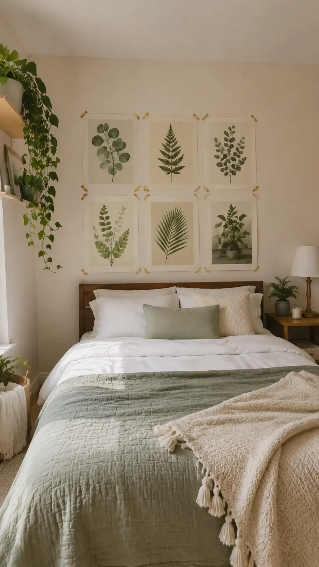
Image credit: homedishy.com
2. Retro Travel Poster Set
There’s something about a vintage travel poster that makes a small room feel bigger — maybe it’s the open skies and distant horizons reminding you that life exists beyond the dining hall. A coordinated set of three or four retro travel prints in the same vintage palette works beautifully over a bed or desk. I went through a phase where my wall said “visit Lisbon” in big art-deco letters, and honestly, I hadn’t even been to Lisbon. Doesn’t matter. What matters is the color blocks read well from across the room, and the shared palette keeps it from looking random. Look for sets rather than single prints; sellers on Etsy and Amazon bundle them specifically for gallery walls, and they’re usually cheaper per print that way.
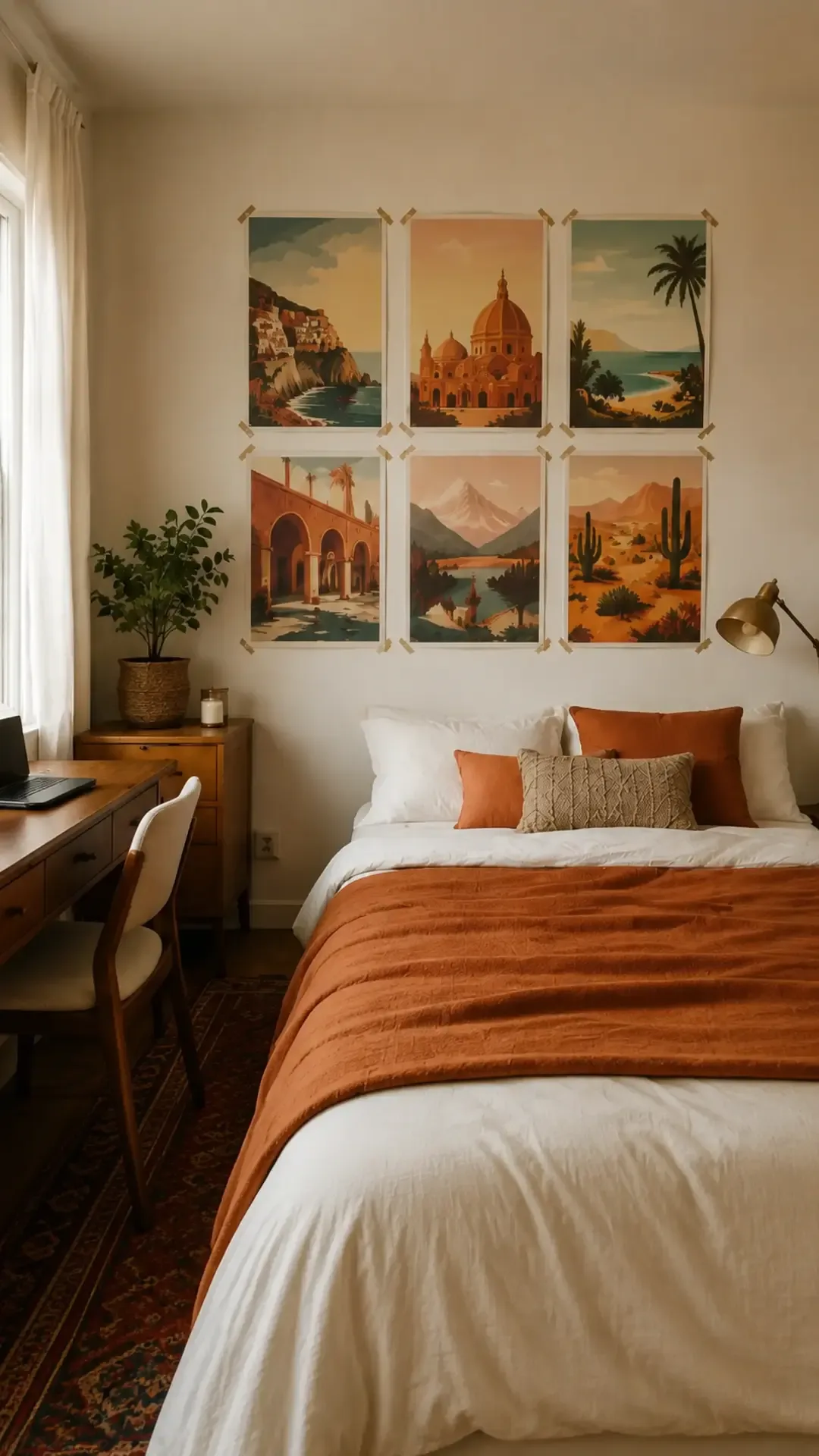
Image credit: homedishy.com
3. Minimalist Abstract Line Art
If your room is already chaotic — clothes on the floor, textbooks everywhere, a chair that functions as a closet — minimalist line art on the walls gives your eyes somewhere calm to land. Black line drawings on cream paper, one or two muted accent tones, done. A trio of related drawings feels surprisingly polished, like you actually thought about this (even if you didn’t). I bought a set of three for twelve dollars, stuck them in matching thin frames from IKEA, and suddenly my side of the room looked like the adult side and my roommate’s side looked like a laundry basket exploded. She still brings this up.
4. Music-Inspired Graphic Print Wall
This one is for the music people, but with a twist: skip the actual album covers. Real album art is copyrighted, it fades fast when printed cheaply, and half the time it looks like a shrine to a band you’ll be embarrassed about by sophomore year. Instead, go for original music-inspired graphics — waveforms, instrument silhouettes, abstract rhythm patterns, concert-poster-style color palettes. My freshman wall had a big waveform print from my favorite song (I literally screenshotted the waveform from an audio editor, printed it, and matted it in black paper — total cost: about three dollars). It referenced my taste without dating the room, and it looked genuinely cool.
5. Positive Typography Poster Wall
I’m going to be honest: most “inspirational quote” walls look like a Pinterest board threw up. The difference between good typography decor and cheesy typography decor is restraint. Pick one short phrase you actually like as the anchor, surround it with two or three smaller prints in the same type style, and keep the color palette tight. “Slow mornings” in a serif font above my desk got me through exactly one brutal organic chemistry semester. Would it have worked if I’d also plastered “live laugh love” next to it? Absolutely not. One message, clean type, done.
6. Celestial Moon Phase Poster Wall
Moon phases, star charts, and celestial illustrations are the dorm poster equivalent of a weighted blanket. Navy, charcoal, cream, and a touch of gold look incredible above a bed, especially with warm string lights nearby. A symmetrical arrangement works best here — the lunar imagery has a natural order to it, so center a horizontal moon-phase print and balance smaller star prints on both sides. My roommate sophomore year did this whole wall in navy and gold and our room smelled faintly of vanilla candles and felt like a cozy observatory. Just keep the gold accents small; too much metallic and the calm palette starts feeling busy.
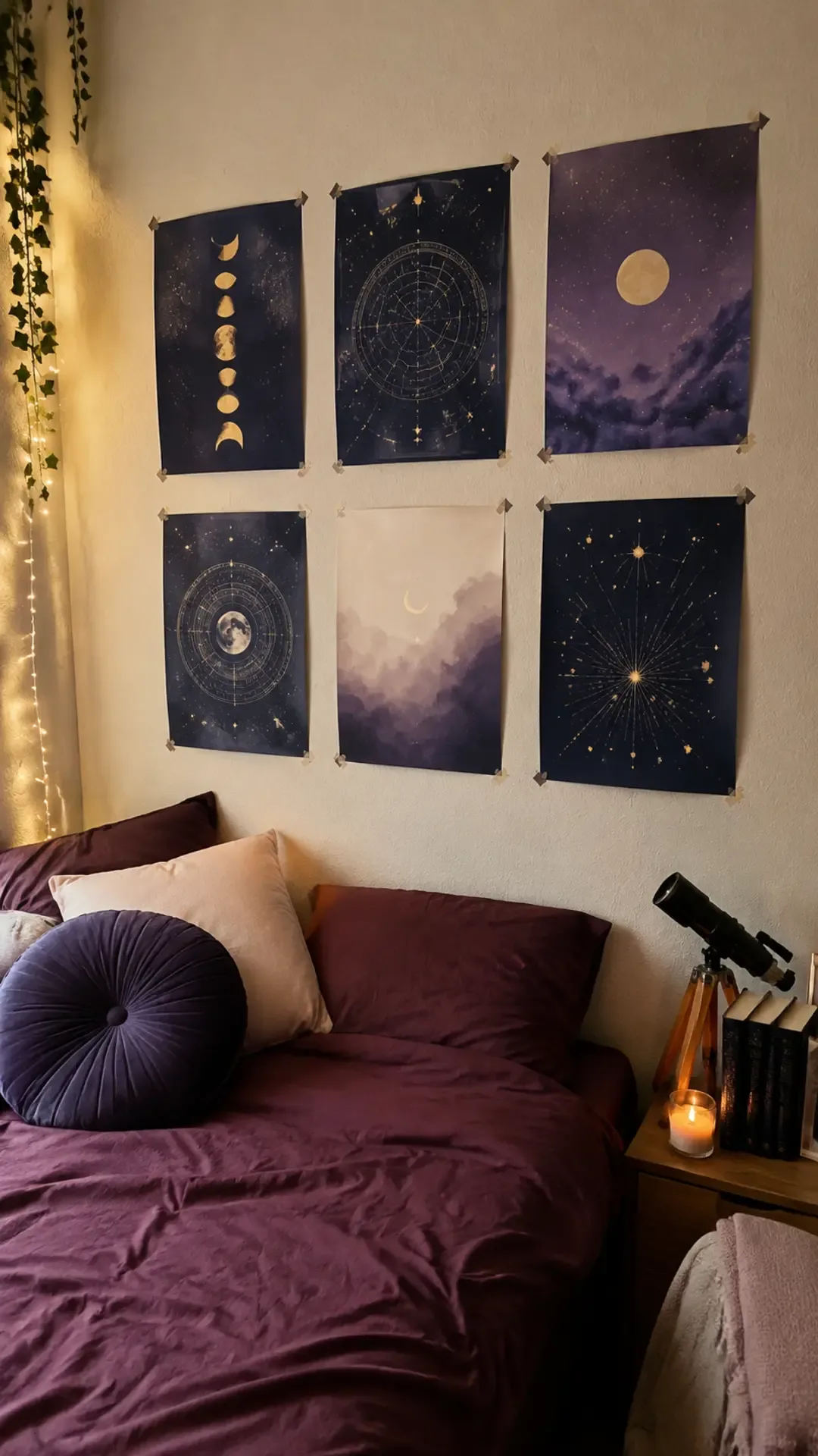
Image credit: homedishy.com
7. Vintage Film Photography Poster Wall
This is the one that made my room feel the most like “me.” Film-style photography — grainy, warm, a little faded — has an intimate quality that no graphic print can match. I printed a batch of photos I’d taken on a cheap film camera over the summer: my dog, my best friend’s hands holding coffee, a street corner in my hometown. Six to ten prints in a loose grid, all edited with the same warm tone so they felt connected. It cost me almost nothing and it was the one wall visitors actually asked about. Pro tip: keep the grid edges a little imperfect. A perfectly straight photo grid reads like an office; a slightly organic one reads like a person lives there.
8. Coastal Surf Poster Set
Even if your campus is landlocked (mine was), coastal posters make a small room feel lighter and more relaxed. Ocean photography, abstract wave shapes, sun-faded graphics — as long as you keep the palette to sandy, blue, and white, it all works together. Three posters is enough; this look doesn’t need a full wall. I had one big ocean print flanked by two narrower wave graphics over my desk, and it genuinely made studying feel slightly less miserable. Echo one blue tone in your bedding or a pillow and the whole corner pulls together.
9. Colorful Y2K Poster Collage
If subtlety isn’t your thing, the Y2K collage is your wall. Checkerboards, chrome stars, wavy shapes, butterflies, bubbly abstract graphics in bright colors — this look fills a big blank wall fast and cheap, which is exactly what you want when your dorm room is mostly wall. The secret to not making it look like visual chaos is controlling the palette: pick three dominant colors and remove any print that falls outside them. I helped a friend do this her freshman year — we laid everything on the floor first, pulled out the five prints that didn’t fit the pink-purple-green scheme, and the difference was night and day. Contained within one clear rectangle on the wall, it reads as intentional. Scattered randomly, it reads as a yard sale.
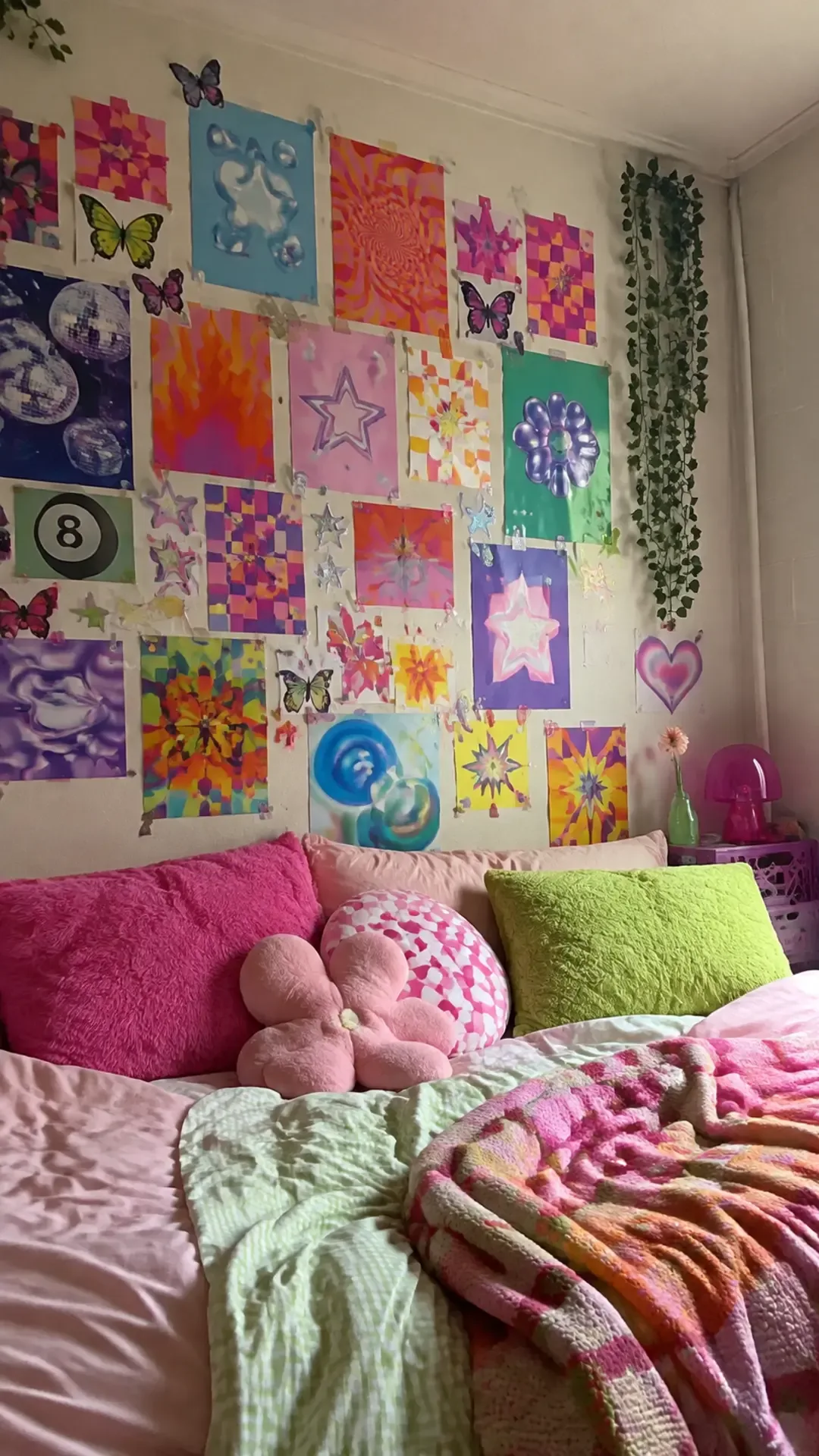
Image credit: homedishy.com
10. Black-and-White City Print Grid
A monochrome city grid is the most grown-up a dorm wall can look. Architecture, shadows, crosswalks, skyline details — all in black and white, all the same size, arranged in a neat grid. Identical print sizes make even cheap artwork feel custom and expensive. I did a 3-by-3 grid over my desk junior year and it was the only decor decision I made that entire year that I never second-guessed. The even spacing matters here, so use paper templates on the wall before you commit. Pair it with warm bedding so the high contrast doesn’t make the room feel cold.
11. Personalized Photo Collage Posters
Nothing makes a new room feel familiar faster than your own photos. But here’s the thing: a hundred photos taped randomly to the wall looks messy, while two or three large printed collage posters look like actual decor. Sort your photos by color or story, build two or three collages with consistent margins (most drugstore photo sites and apps like FreePrints will do this for you), and print them as proper posters. Keep private details and unapproved photos of friends off the wall — dorm walls are public space whether you like it or not. One repeated photo treatment across all collages, warm or cool or black and white, makes different memories read as one collection.
12. Bookish Dark Academia Poster Wall
If your ideal Saturday involves a library, a thunderstorm, and a novel with a sad ending, this is your wall. Antique book illustrations, botanical studies, old maps, classical sketches, moody still lifes in brown, olive, cream, and black. Seven to ten prints layered around a desk area with a warm lamp underneath, and your dorm corner suddenly feels like a Victorian study. I went full dark academia my senior year and I don’t regret a single olive-toned map. The lighting matters more here than with any other style — a warm desk lamp below the gallery makes the vintage paper tones glow instead of looking flat and dark.
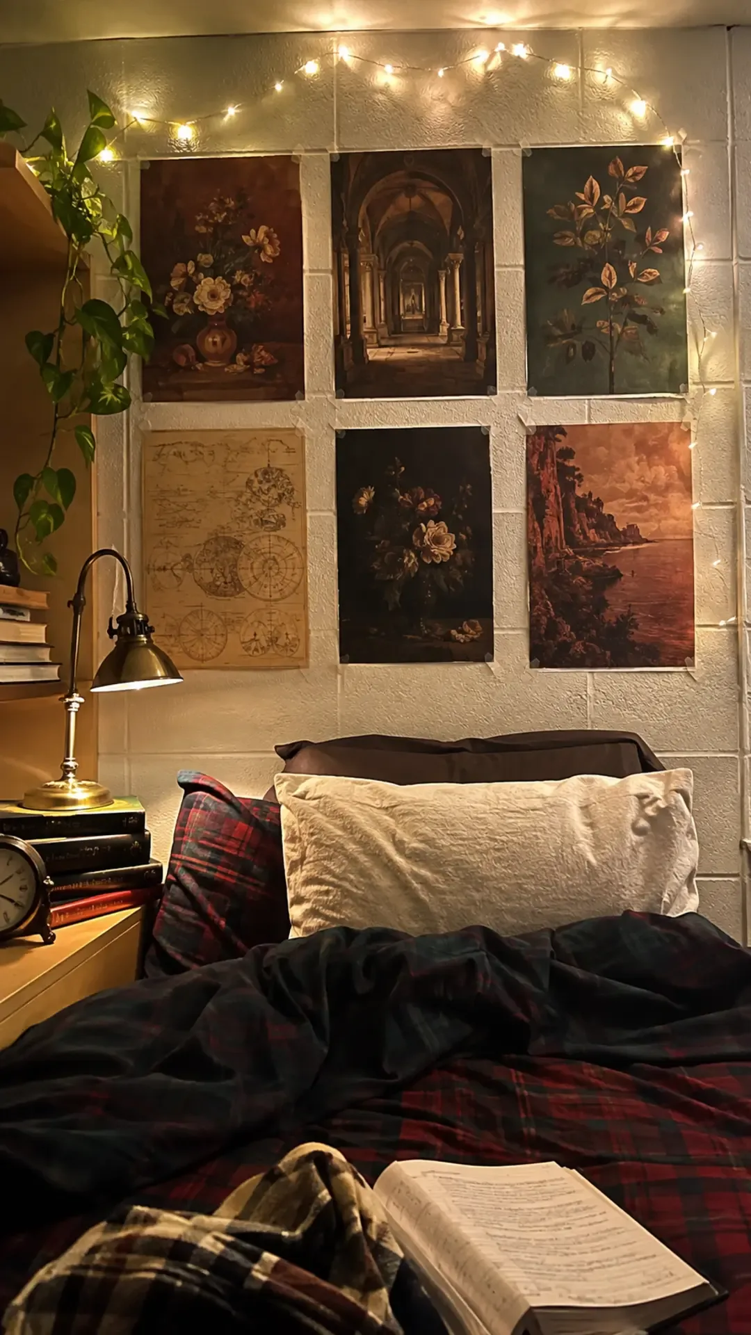
Image credit: homedishy.com
13. Eclectic Mix-and-Match Poster Wall
Maybe you can’t commit to one aesthetic. Same. The eclectic wall lets your botanical prints, your travel posters, your weird abstract stuff, and your photography all coexist — as long as you give the collection one unifying rule. It can be a repeated color (I used terracotta in at least three prints), consistent white margins, or the same paper finish. Start with your largest piece slightly above the visual center, build medium prints around it, and fill gaps with small ones. Step back every few prints. The floor-lay trick works best here: arrange everything on the floor first, photograph it with your phone, and only move to the wall once the photo looks right. Your camera sees imbalance your eyes miss.
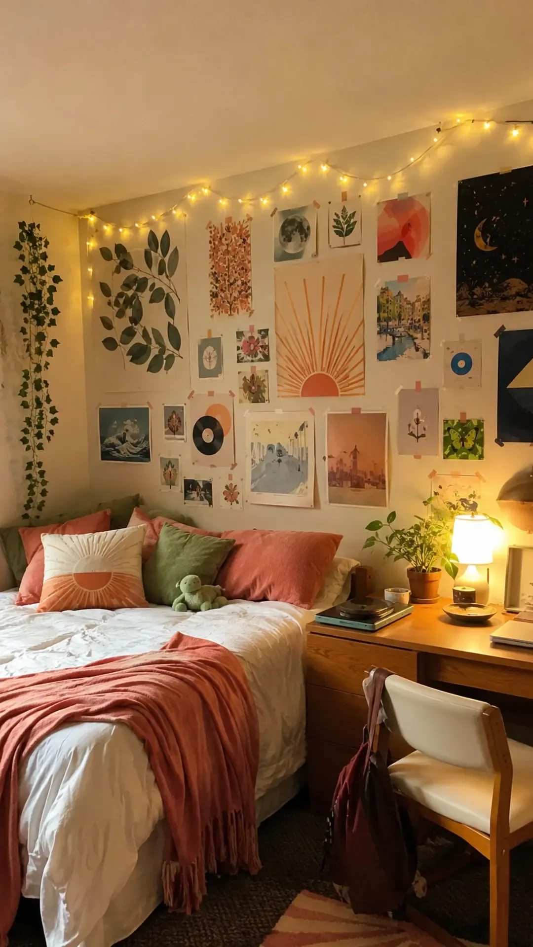
Image credit: homedishy.com
How to Hang Posters Without Losing Your Security Deposit
This is the part I wish someone had taught me before the masking-tape incident. Here is the actual process, refined over several dorms.
Step 1: Read your housing policy. Seriously, read it. Most dorms allow removable adhesives but ban nails, screws, and thumbtacks. Some specify which products are approved. Knowing the rules takes five minutes and saves you a damage charge.
Step 2: Use the right removable products. Command poster strips are the gold standard — they hold real weight and come off cleanly if you follow the removal instructions (pull straight down slowly, never yank). For lightweight prints, poster putty works, though it can melt and stain in a hot room, so skip it if your dorm has no AC. Washi tape is great for thin prints and doubles as decoration. What doesn’t work: masking tape, duct tape, regular Scotch tape, hot glue, and whatever I used freshman year.
Step 3: Template before you commit. Cut scrap paper to the size of each poster, tape the templates to the wall with painter’s tape, and live with the arrangement for a day. This one step prevents 90 percent of crooked, crowded, or lopsided gallery walls. I skipped this exactly once and had to peel six posters off the wall and redo everything.
Step 4: Mount from the center outward. Start with your anchor piece — usually the largest print — and build outward. Use a small level or even a phone level app to check the first few. Step back after every two or three posters. The wall will lie to you up close; the view from across the room is the truth.
Step 5: Remove them properly at move-out. When you take posters down, remove the adhesive slowly using the product’s recommended method, and don’t rush it during the chaos of move-out day. I do my walls the night before, calmly, with the instructions in front of me. Future me is always grateful.
Common Mistakes to Avoid
I’ve made all of these. Learn from my walls.
Hanging everything with the wrong adhesive
The number one dorm wall crime. Regular tape damages paint, poster putty stains in heat, and nails are almost always banned. Match the product to the weight of the poster and the policy of your dorm. When in doubt, Command strips. They cost more than tape and they are worth every cent.
Cramming the wall
Beginner me believed every inch of wall needed covering. The result looked like a collage made during an earthquake. Leave breathing room — about two inches between prints in a gallery wall, and actual empty wall space around the edges. Negative space is what makes a poster wall look designed instead of desperate.
Ignoring color completely
Thirteen posters in thirteen different color palettes will never look intentional, no matter how well you space them. Every wall needs a shared thread: a repeated color, a shared finish, matching margins, or a common subject. Pick one rule and enforce it ruthlessly when choosing prints.
Buying everything at once
Here’s a mistake that cost me real money: I once ordered a full matching poster set online before living in the room, and it clashed with the bedding, the desk, and the weird yellow undertone of the dorm lighting. Start with three to five prints, live with them for a week, then add more. Your wall should grow into the room, not be imposed on it.
Hanging posters behind the door swing or under the sprinkler
Practical stuff that nobody tells you: posters get shredded by door swings, curl from heat near radiators, and can get you in trouble if they block sprinklers or smoke detectors. Measure your usable wall area first, and leave clearance around outlets, vents, and anything safety-related.
Final Thoughts
The dorm room I have the fondest memories of wasn’t the nicest one — it was the one with the botanical prints above the bed and the waveform of my favorite song by the desk. Posters are the fastest way to stop living in a room and start living in your room. They cost almost nothing, they come down without a fight, and they turn blank walls into the background of your actual college life.
Start small, pick a style that feels like you, and use the right adhesive. By the end of the semester, you’ll have a wall that makes people say “wait, this is actually so cute” — and you’ll have done it for less than the cost of one textbook.